Assignment 1: Bad Photos
William Ito
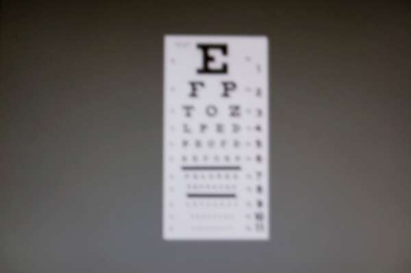
This shot fulfills requirements 3 (no focus) and 5 (poor composition).
|
This shot was a lot of trial and error finding the right combination between out of focus and exposure time to keep the first few rows readable so it is identifiable as an eye-chart. Unfortunately, I lost the exact settings when the album was deleted.
The eye-chart I photographed does not actually exist anywhere - this is actually a photograph of my monitor displaying a (in focus) eye chart on a random wall texture I found online. It worked well though. The vignette effect was unintentional, but I liked it and emphasized it in post-processing.
The vignette combined with the centering of the eye-chart really makes this a stark image, which I like. If I was more inclined to deep statements, I'd probably say something about its representation of man's inhumanity to man or something.
Eddy: I quite like this one - it's very clean, tells a good story, and meets the requirements well. Brainteaser: Where is the vignetting here coming from?
