Assignment 4: Architecture and InteriorsRachel Powell | ||
|
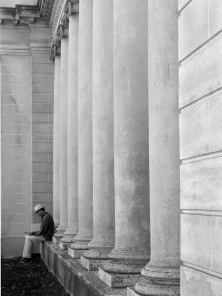
This photo meets Requirement 2 - No vertical vanishing point and Requirement 4 - Repeating patterns. I took this shot with a focal length of 10mm, an aperture of f/8, and an exposure of 1/60s. At first I just wanted to get an interesting shot of the columns, but I saw this man sitting at the base of one of the columns and wanted to include him in the picture, as he provided color and contrast and a sense of scale. I intended this picture to fulfill my no vertical vanishing point requirement, but my camera must have been slightly tilted up because the corner behind the man was parallel to the frame, but the edge of the wall closest to the camera was not. I did a perspective transform in Photoshop to correct this. I also cropped the picture because too much of the wall in the foreground was showing, and I thought it distracted from the man and the columns. I left some of the wall in the shot, though, because the horizontal lines make an interesting contrast to the vertical columns. The man and the columns were completely in the shade, while the wall in front was in the sun. The wall ended up being correctly exposed while the man was slightly underexposed. I corrected this in Photoshop by making a brightness/contrast adjustment layer, then masking the wall in the foreground so it wouldn't become overexposed. I then applied a black/white adjustment layer, and messed with its settings to make the grass and the man's jacket darker, and highlight the texture of the columns. I really like how the columns turned out. | ||
| << Previous | Back to All Photos | Next >> |
