Constellation is a visualization system for the results of queries from the MindNet natural language semantic network. Constellation is targeted at helping MindNet's creators and users refine their algorithms through plausibility checking, as opposed to understanding the structure of language. Section 5.1 contains a full explanation of our chosen task.
We designed a special-purpose graph layout algorithm that exploits higher-level structure in addition to the basic node and edge connectivity. Our spatial layout prioritizes the creation of a semantic space to encode plausibility instead of traditional graph drawing metrics such as minimizing edge crossings, as covered in section 5.2.
Section 5.3 discusses our use of several perceptual channels both to minimize the visual influence of edge crossings and to emphasize highlighted constellations of nodes and edges. Section 5.4 outlines our navigation and interaction approaches, including a new pie flipper interaction technique that exploits a scrolling mouse for selecting instances of a constellation category. We cover implementation in Section 5.4, and the chapter concludes with a discussion of the results and outcomes of the project in section 5.6.
An explicit goal of the Constellation project was help a target group of people carry out a particular task more effectively, as opposed to finding a group of people with a problem that was a good match with a particular preconceived visualization solution. We followed a user-centered design approach as much as possible given the time constraints of our user community, who were quite available at the beginning and middle of the process. We conducted several preliminary interviews to determine the main design goals, and obtained detailed feedback that guided the evolution of several paper and software prototypes. Involvement by our target users dropped off towards the end of the design process when their attention was diverted to a new phase of their project. This situation is relatively common in user-centered design, and we relied on information gleaned from previous interactions. Our target user community was extremely small: a few computational linguists working on the MindNet system in the Natural Language Processing group at Microsoft Research.
MindNet is a system that constructs a large semantic network by parsing the text of machine-readable dictionaries and encyclopedias [DVR93,RDV98]. Its possible applications include grammar checking, intelligent agent help systems, machine translation, and common-sense reasoning.
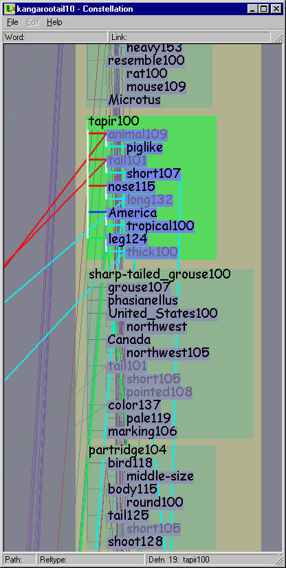
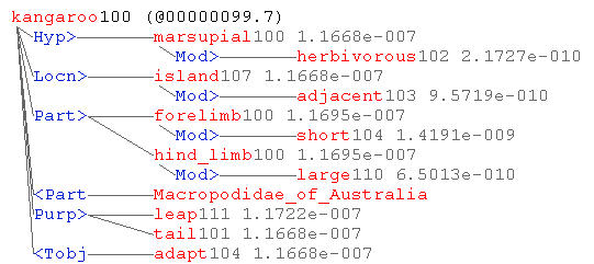
The MindNet parsing process turns a dictionary or encyclopedia entry sentence into a small definition graph of roughly one dozen nodes. The nodes represent word senses: a natural language word may have several meanings depending on context, for instance ``bank'' as ``financial institution'' or ``side of a river''. MindNet distinguishes between these word senses by adding a numerical suffix and treats them as separate nodes. Figure 5.1 shows the parsed definition graph for one of the senses of the word KANGAROO. The original English sentence is:
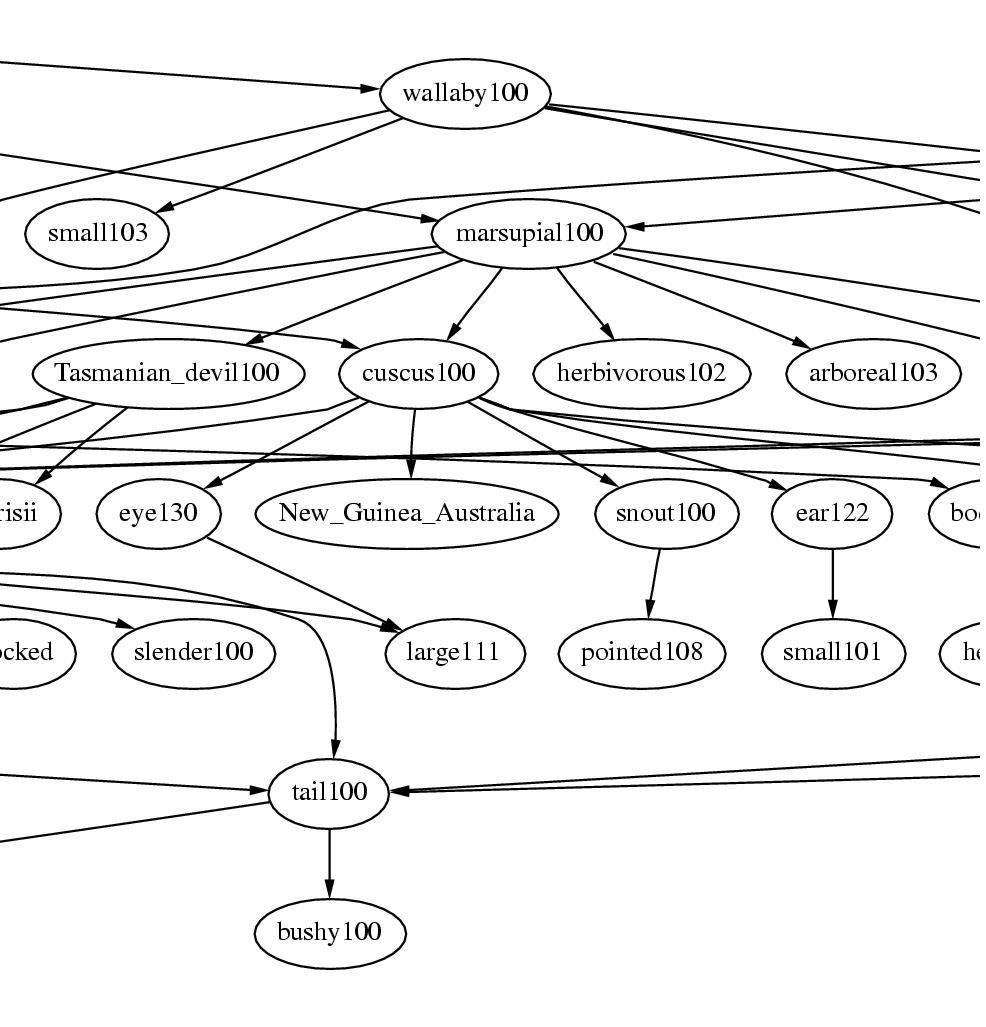
KANGAROO: Any of various herbivorous marsupials of the family Macropodidae of Australia and adjacent islands, having short forelimbs, large hind limbs adapted for leaping, and a long, tapered tail.The links represent directed labelled relations between words, such as is-a, part-of, or modifier. Parts of the sentence are parsed correctly, for instance the is-a relation between KANGAROO and MARSUPIAL, and the modifier relation between MARSUPIAL and HERBIVOROUS. However, AUSTRALIA is attached to MACROPODIDAE, the Latin name for the species, instead of the phrase ADJACENT ISLANDS. This kind of errors is one example of how the current MindNet algorithms could use refinement.
Figure 5.1: Parsed definition graph from MindNet. The parsed definition graph for KANGAROO100 is a mixture of plausible attachments, such as KANGAROO is-a MARSUPIAL, and errors, such as the misattachment of AUSTRALIA to the Latin name for the species instead of to the phrase ADJACENT ISLANDS.
Two definition graphs that share a node can be combined into a larger graph, which can be further enlarged by incorporating other definition graphs with shared nodes. The unification process ultimately results in a huge semantic network that can contain millions of nodes.
Both the target users and the author agreed that the primary goal was an exploratory system that would be actively useful in day-to-day research. The possible goal of an expository demonstration was deemed to be less important.
Although MindNet is extremely successful by the standards of the NLP field, it is known to be imperfect. The semantic network is automatically constructed, but a feedback loop is part of their ongoing research program: the answers returned by MindNet are hand-checked by human linguists, who determine whether they are plausible. Problems are addressed when possible by improving the algorithms used to create MindNet, and the network is regenerated.
When we first heard about the plausibility-checking task in the initial interviews, we thought that the researchers would want to see a global overview of the entire network, and anticipated tackling some large dataset algorithms. However, further discussions soon revealed that a large-scale global overview was not what the researchers needed. They already understood the major features of the global dataset, which is highly connected: one word can connect to most of the other words in the network after three or four hops, and to all in five. The semantic networks generated by MindNet are sufficiently large and interconnected that its developers find it impractical to study their global structure for plausibility-checking purposes.
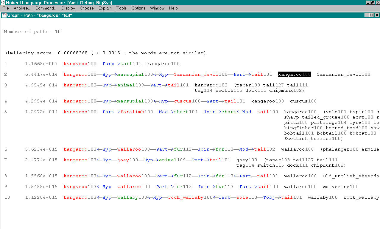
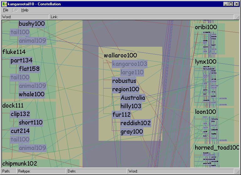
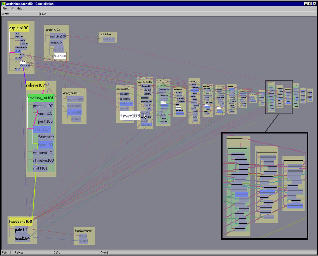
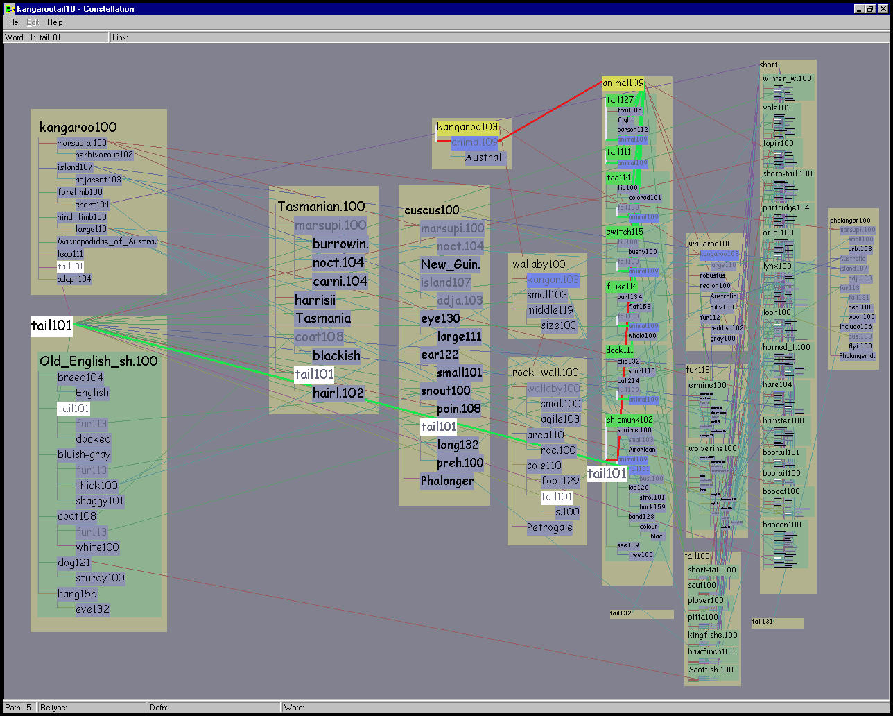
They instead rely on a query engine to probe a small subsection of the network, and each of these snapshots is checked for potential problems. The linguist user provides a query consisting of two words and the number of paths to return. MindNet computes the best paths between the words, as shown in Figure 5.2. The system returns the requested number of paths in order according of computed plausibility, which is derived using (among other factors) the edge weights in its unified network of definition graphs. Each path is accompanied by the first words of every definition graph used in its computation. These words are shown in black on the right side of Figure 5.2. The linguist would hand-check the results to see how well the computed plausibility matched the intuitions of a human: for example, that all high-ranking paths were believable, and that all believable paths were highly ranked. Another check was for stop words that might be polluting the dataset: that is, words such as SHE, IT or THE, which are so common in English that they are usually excluded from computations.
Figure 5.2: Previously existing textual view in MindNet.
The query results returned by MindNet when asked for the ten best
paths between KANGAROO and TAIL. On the left are the
colored words in the path itself, and on the right in black are the
first words in each of the definition graphs used in the computation.
The first path is only one hop since TAIL101 is present in the
definition of KANGAROO100. That word is highlighted in black
because the user has clicked on it, triggering a popup window
showing the information in Figure 5.1. Making
plausibility judgements in this interface requires a great deal of
flipping between windows. The second path uses the definitions for
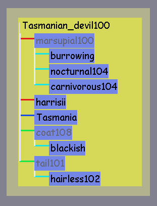
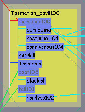
both KANGAROO100 and TASMANIAN_DEVIL100 (shown in Figure
5.10 on page ![]() ), both of which
contain the word MARSUPIAL100. The fifth path is an example of
one that required a large number of definition graphs to compute.
), both of which
contain the word MARSUPIAL100. The fifth path is an example of
one that required a large number of definition graphs to compute.
A single word sense can appear in multiple places in a query result: for example, KANGAROO103 is included in two different paths, appears as a leafword inside the definition of WALLABY100, and also appears as a headword with its own definition graph. These shared words are the reason it is difficult to understand how paths relate to each other and to the definition graphs used to create them.
The previously existing MindNet software interface to a path query shown in Figure 5.2 provided a textual view of both the paths and the headwords of the definition graphs used in the computation. The investigating linguists could click on any of those headwords to open a separate popup window to see a definition graph, as shown in Figure 5.1. This approach is problematic because several relationships were hard to understand: the relationship between one path and another, between a path and its constituent definitions, and between the definitions of different paths. For instance, since each path is listed separately, the only way to tell that two paths have shared subpaths is to read the individual words and cognitively compare them. To judge whether a path was plausible, the users had to click on several of the definitions to bring up individual definition windows, and then manually flip between many windows. The resulting cognitive load was extremely high since the task entailed comparison of currently seen items to previously seen items, which is much more difficult than side-by-side comparison.
The MindNet developers expressed a desire to see an integrated view of the query results where paths were shown in the context of all definition graph words used in the path computation. The Constellation system was designed to be a special-purpose algorithm debugging tool. Although the input dataset consists of the relationships between English words, Constellation is not intended to shed light on the structure of the English language per se, since the linguists are quite familiar with that. Some of the other characteristics that we discovered in our preliminary interviews provided guidance for our iterative design process:
The query results returned from MindNet can be interpreted as a single medium-sized directed graph, ranging from a few hundred to a few thousand nodes. We created a spatial layout algorithm that visually encoded domain-specific features, as opposed to the usual approach of using spatial position to minimize false attachments. Our novel layout algorithm uses a curvilinear grid as the backbone for path layout, and attaches definition graphs to words on a path. Our final layout resulted from several iterations of working software prototypes, since we sought to balance the goal of visually communicating the maximum semantic content with that of providing reasonable information density.
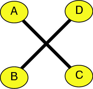
Figure 5.3: Traditional layouts avoid crossings to prevent false attachments. Left: Node-edge crossings lead to ambiguity, where it is not clear if A is connected to C and B is merely in the way, or if A and B are connected as are B and C. Right: Edge-edge crossings create visually salient ``X'' artifacts that draw the viewer's attention from the important aspects of the graph structure.
In most traditional graph drawing systems, spatial position bears most of the perceptual burden, and interaction is used simply for basic navigation. There are several standard constraints on spatial positioning, including crossing avoidance, bend minimization, and edge length minimization. The various classes of layout methods are rarely optimized for all three: for instance, force-directed layouts focus on edge length minimization and pay short shrift to crossing avoidance. In Constellation, we take a novel approach to the edge crossing problem. Many of the traditional methods have the need to minimize edge crossings as one of the major constraints on spatial positioning, so as to avoid the visual impression of attachments that do not reflect the true structure of the dataset. Figure 5.3 shows two perceptual problems caused by false attachment with crossings: ambiguity when links may pass underneath nodes, and distracting visual artifacts at edge-edge crossings that divert the viewer's attention from the important graph structure.
However, a key insight from the information visualization literature is that spatial position is the strongest perceptual channel. Instead of ``wasting'' the power of spatial position by simply avoiding false attachments, we use position to visually encode the domain-specific attribute of plausibility, as shown in Figure 5.4. Our custom layout algorithm uses the high-level structures of paths and definition graphs to make node placement decisions. Even though both the paths and the definition graphs are a subset of the global semantic network, they play extremely different roles in analyzing the behavior of the MindNet program. We thus wanted them to be easily distinguishable in our visualization.
Figure 5.4: Plausibility gradient encodes a domain-specific attribute. Since spatial position is the strongest perceptual channel, we use it to communicate information about the domain instead of devoting this channel to avoiding the problems of false attachments because of edge crossings. The horizontal position of a definition graph is tied to MindNet's computed plausibility, and boxes on the plausible left are drawn larger than those on the implausible right. We avoid false attachments using selective highlighting, as shown in Figure 5.5.
Figure 5.5: Selective emphasis avoids perception of false attachments. Left: Our layout algorithm results in crossings for the long-distance edges that connect all instances of a shared word. Right: Selective emphasis through interaction and additional perceptual channels avoids the perception of false attachments.
Our algorithm results in many crossings for the long-distance edges between all instances of a shared word. We avoid false attachments by using several other perceptual channels in concert to create dynamically changeable foreground and background visual layers. The user can interactively explore highlighted subsets ( constellations) of the graph while retaining the context of the entire dataset. Figure 5.5 shows that we can avoid the perception of false attachments with a combination of interaction and additional perceptual channels, instead of relying on spatial position to bear the entire perceptual burden.
We chose to lay out the graph in 2D space instead of 3D space for two main reasons: the relatively modest size of the graph (under five thousand nodes), and the extremely strong task dependence on label reading.
Our graph layout algorithm depends on the domain-specific elements of paths and definition graphs. The paths returned by MindNet are used by our layout algorithm to create a skeleton framework, around which the definition graphs are inserted.
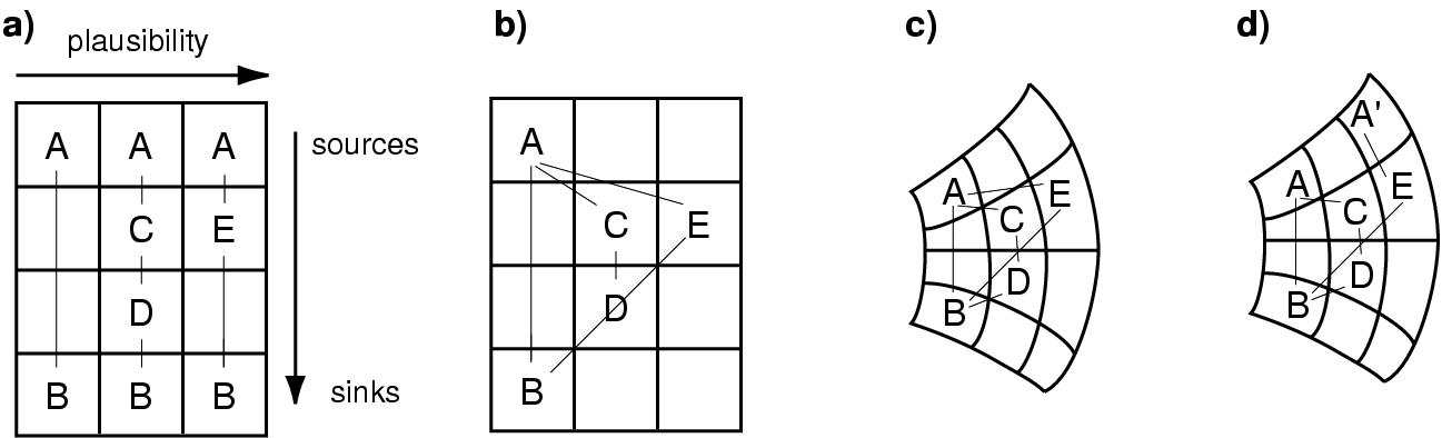
Figure 5.6: Paths in grids. (a) The base grid has a left to right plausibility flow between paths and a vertical flow within each path. (b) Consolidating shared items leads to the false attachment between D and the B-E link. (c) A curvilinear grid solves the colinearity problem. (d) Multiple endpoints are also accommodated by the curvilinear grid.
The broad layout parameters are based on the two orderings returned directly by MindNet: horizontal flow is derived from the plausibility ordering between the paths, and vertical flow is based on the internal ordering of words within a path, with the source on top and the sink on the bottom. Figure 5.6 (a) shows a rectangular grid with this ordering, using a simple example dataset. The number of grid segments horizontally is simply the number of paths. The number of vertical segments is the hop count N of the longest path in the dataset: N = 4 in the figure. Paths with fewer than N nodes will have some empty internal vertical segments, but the source and sink nodes are always laid out in the first and final spots.
However, this layout draws the same node in more than one place, which hides important connectivity information. Figure 5.6 (b) shows the same grid after we have consolidated shared nodes. If a pathword appears in more than one path, it is drawn in only the band of the most plausible path.
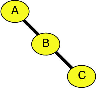
The problem with this layout is that the line between E and B is colinear with the line between D and B, such that it is hard to tell whether E is connected to D or B. These false attachments are unavoidable if nodes are laid out on rectangular grids and connected by links drawn as straight lines. The solution is to either draw links as curved lines or lay out nodes along curves instead of along straight lines. We chose the latter approach for the two reasons of perceptual simplicity and computational efficiency. People can more easily perceive a connection between two items connected by a straight line than two items connected by a curve, in keeping with the Gestalt principle of good continuation. Also, drawing curved lines is much more computationally expensive than drawing straight lines, since graphics libraries must draw a single curved line as a piecewise-linear approximation using many short straight segments. Line drawing happens much more frequently than layout in our system. Figure 5.6 (c) shows that a curvilinear grid eliminates the colinearity problem.
The most important path will still be vertical, and highly ranked paths will be only slightly curved. The least important paths are both the most distorted and the longest. There are both perceptual and practical reasons for this choice. The shortest and straightest path will appear most perceptually important in accordance with its high weight by the Gestalt principle of proximity. Practically, the less plausible paths often have more hops than highly ranked ones, so it can be useful to have a greater distance along which to place them.
The example dataset previously shown is simpler than a real query result, which has multiple sources and sinks. (Recall that although the submitted query has a single source word and single destination word, the query results have word senses as endpoints.) Figure 5.6 (d) shows an example where the final path has a different source than the others, which is easily accommodated by the curvilinear grid.
Figure 5.7: Bad approaches. (a) The middle path is the shortest in a diagonal layout. (b) In the top-top layout the display area has the opposite aspect ratio than a standard monitor.
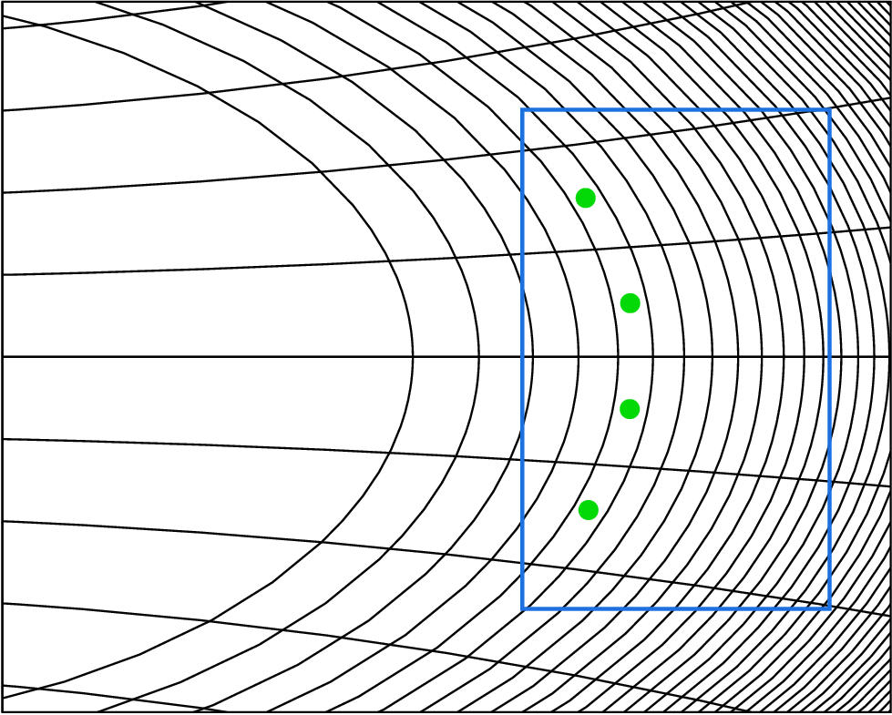
Figure 5.8: Curvilinear grid. Parabolas and
circles are used to generate the curvilinear grid that is the basis
of our layout algorithm. Here the aspect ratio of the display
elongates the circles to give them the appearance of ellipses. The
distance between circle radii decreases on the implausible right. The
section of the grid used in a typical figure is denoted by the blue
box, with green dots indicating the first band of cells used. The
difference in curvature between the grid shown here and
the grids visible in Figure 5.13 (page ![]() ) is
a result of fitting the blue box to the aspect ratio of the display
window.
) is
a result of fitting the blue box to the aspect ratio of the display
window.
There are many possible ways to construct a grid of bands and segments. We considered other possible choices for the locations of the path endpoints, but ruled them out because of undesirable perceptual or practical considerations. The diagonal layout in 5.7 (a) must either have a mid-ranked path as the shortest one or introduce some nonobvious ordering of the paths. The top-top approach of 5.7 (b) leads to a display area taller than it is wide when there are a large number of paths, which is the opposite of the standard aspect ratio of a computer monitor.
Figure 5.8 shows the particular curvilinear coordinate system that we chose, created by intersecting a family of parabolas with a family of circles. We wanted bands on the implausible right to be thinner than those on the plausible left, so that the circle radii decrease logarithmically according to the horizontal plausibility gradient.
We parametrize a parabola for row i as

After experimentation, we empirically set the height offset  of
the parabola simply to i, and the ``curviness''
of
the parabola simply to i, and the ``curviness''  to
to  .
Solving for x gives us
.
Solving for x gives us

The circles for column j are parametrized by

More experimentation led to radius settings of  .
Substituting the value of
.
Substituting the value of  into the parabola
equation from above leads to
into the parabola
equation from above leads to

We found a simple analytical solution using Mathematica [Wol91]:

Paths are the backbone of our layout algorithm: each unique pathword
is laid out in its own curvilinear grid cell. We fill in the
definition graphs by attaching each of them to one of the pathwords.
MindNet provides an explicit association in its returned query result
between a given path and all the definition graphs used in its
computation. For instance, the fifth path in Figure 5.2
(page ![]() )
is explicitly associated with 23 definition graphs. We assign
definition graphs that appear in multiple paths to the most plausible
one: for instance, KANGAROO100 appears in paths 1, 2, 4, and 5,
but is assigned to path 1.
)
is explicitly associated with 23 definition graphs. We assign
definition graphs that appear in multiple paths to the most plausible
one: for instance, KANGAROO100 appears in paths 1, 2, 4, and 5,
but is assigned to path 1.
In our layout algorithm we further assign each definition graph to a single word in that path. When the headword for the definition graph is the same as the pathword, the assignment is obvious. The more common case is that some leafword in the definition graph appears on the path. For instance, the definition of TAPIR contains the word SHORT, which is a pathword in the fifth path.
Pathwords that appear on more than one path can have definition graphs from all of them associated with it. We call the combination of a pathword and all its associated definition graphs a path segment.
Figure 5.9: Attaching definitions to path segments. Every definition graph is drawn attached to a pathword. Left: When a pathword has been assigned its own definition graph, it is drawn at the top of the path segment box against a tan background instead of nested in the usual green box. Right: Some words appear on a path because they appear as a leafword in a definition graph, and are not themselves defined. In this case only the pathword is drawn against the tan background, and each attached definition graph is drawn in its green box.
Although the placement grid is curvilinear, our drawing algorithms
uses rectilinear boxes anchored at the upper left corner of the grid
cell. The box allocated to each path segment is drawn in tan, as shown
in Figure 5.9. The pathword itself is drawn at the top
of the tan box. If a pathword has been assigned its own definition
graph, as in the left side of the figure, that is also drawn in the
tan section of the box. If there are
other definition graphs assigned to that path segment, each of them is
enclosed in a green box nested within the tan pathword box. The right
of Figure 5.9 shows a path segment where the pathword
is not itself defined, but has two green-boxed definition graphs
associated with it. Some path computations involve the pooled
influence of many definition graphs for a single pathword, so there
may be many green boxes vertically stacked inside a single tan
pathword box, as in the top left of Figure 5.14 on page
![]() . Path 7 of the KANGAROO-TAIL
ten-path dataset is an extreme example in the bottom right of that figure,
and is also visible as text in Figure 5.2 (page
. Path 7 of the KANGAROO-TAIL
ten-path dataset is an extreme example in the bottom right of that figure,
and is also visible as text in Figure 5.2 (page
![]() ).
).
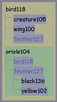
Figure 5.10: Definition graph layout. Left: In the base layout, words are connected by rectilinear links. The headword is drawn at the top left and leaf words are enclosed in blue boxes. All vertical lines are white, and the horizontal lines are colored according to relation type. Middle: We draw long-distance links between the master version of a word and all its duplicated proxies. Right: The unhighlighted state is the default when a definition graph is not the focus of the user's attention.
Definition graphs are drawn with a ladder-like rectilinear structure,
showcased in Figure 5.10, that is deliberately
similar to the layout familiar to the linguists (shown in
Figure 5.1 on page ![]() ). Each leafword is
enclosed in its own blue label box. Vertical edges show the
hierarchical microstructure inside the definition graph, and
horizontal edges are color coded to show the relation type. (The full
list of colors is given in Table 5.1 on page
). Each leafword is
enclosed in its own blue label box. Vertical edges show the
hierarchical microstructure inside the definition graph, and
horizontal edges are color coded to show the relation type. (The full
list of colors is given in Table 5.1 on page
![]() .) The left and middle of Figure
5.10 show the highlighted state, and the right the
unemphasized state.
.) The left and middle of Figure
5.10 show the highlighted state, and the right the
unemphasized state.
Pathwords that are shared among many paths are combined to create a semantically meaningful global structure encoding computed plausibility. Although pathwords and thus entire definition graphs are drawn only once, a word that appears in more than one definition graph will be drawn multiple times. We designate the master version of a definition graph leafword to be the one attached to the most plausible path, and draw it in black. All subsequent instances of the word are proxy versions, which are drawn in grey and visually connected to the master word by a long slanted line. These lines are visible in the middle and right sides of Figure 5.10, and in all other Constellation screen shots. The left side of Figure 5.10 is the only figure that does not show the long-distance proxy links, so as to showcase the base rectilinear definition graph layout.
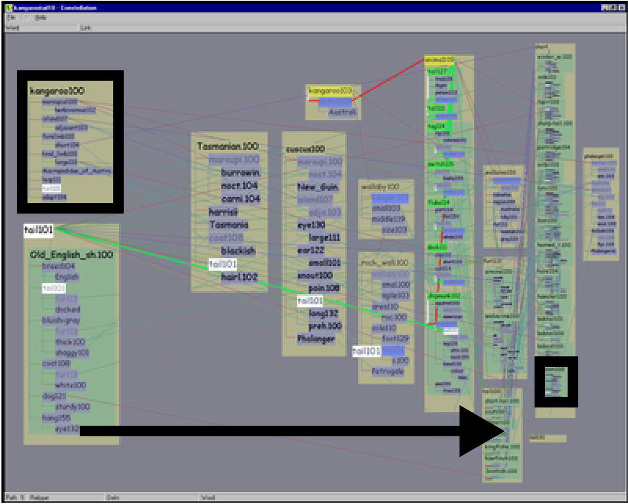
Figure 5.11: Very early layout with empty proxy slots. In this very early layout attempt only master versions of words were drawn, so it was hard to read any single definition graph when zoomed in. Here the definition graph constellation for KANGAROO is highlighted.
An earlier iteration of our layout drew only the master word, leaving the proxy slots empty, as in Figure 5.11. Our intent was to ensure that the users were aware that proxy words appeared in multiple places in the input data. However, we observed that the linguists spend a significant amount of time reading individual definition graphs, and were disoriented when forced to navigate back along the proxy links during closeup reading. In the final version we instead optimized the spatial layout to support this reading task. In Section 5.3 we discuss the interaction paradigm that we designed to ensure that the connections between multiple instances of a shared leafword were always visually salient.
Figure 5.12: Early sparse layout. An earlier version of the software used only the base layout algorithm described in the previous sections, which is successful at encoding the plausibility spatially but results in a somewhat sparse layout with only about 20 legible words.
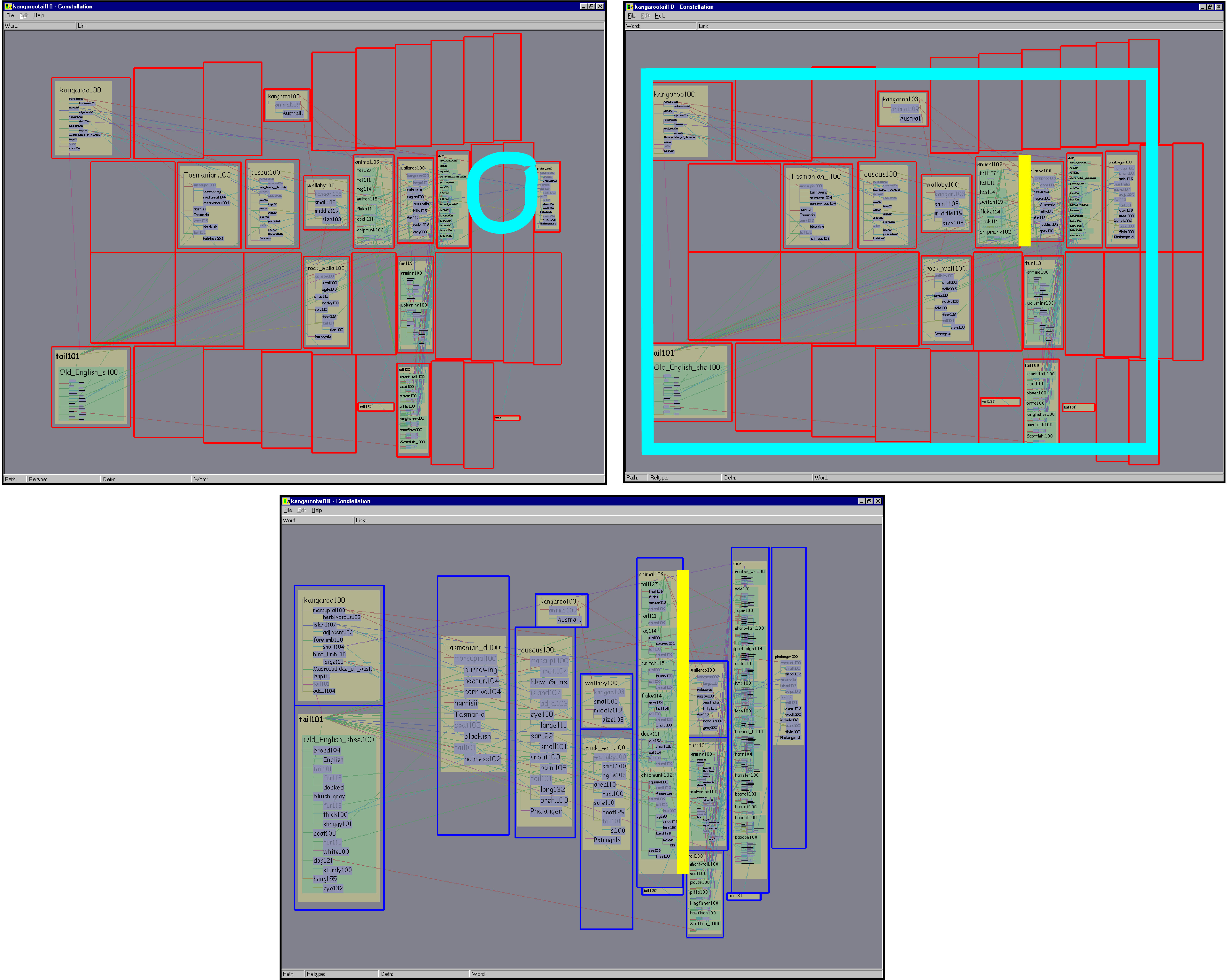
We need to balance the two competing needs of creating a spatial arrangement that faithfully reflects the structure of the dataset, and filling space to achieve a uniform information density. Figure 5.12 shows a layout from one of the earlier software prototypes, with a grid constructed according to the base algorithm described in section 5.2.2. The layout exactly represents the desired domain specific information, but is quite sparse. Although the empty space does have meaning, we can achieve much greater information density. Figure 5.13 shows a progression towards a more dense layout that retains almost all the informative semantics of the base algorithm shown in Figure 5.12.
The first optimization involves avoiding unnecessary path segments. Some path segments have no associated definition graphs at all, containing only a single pathword. That word is guaranteed to occur in one of the definition graphs in either the previous or the next path segment. In this case we elide the singleton path segment, so that the grid cell can be used more productively. The drawn links between the words in the path will still visually indicate a path, which is more comprehensible without the extra visual step of following links to the singleton pathword. Comparing the top left of Figure 5.13 to Figure 5.12 shows the information density improvement of 40 words due to this optimization.
Figure 5.13: Adjusting grid for maximum information density. Top Left: This view is already an improvement over the very sparse layout in Figure 5.12, because the singleton path segments have been elided. In the fullscreen view, over 60 words are legible. However, further improvements are still possible. The cyan circle shows a horizontal gap between the 7th and 10th band. Top Right: Removing the horizontal gap results in a more compact grid. Here we maintain the identical window borders in all three screen shots to facilitate size comparisons, but the cyan outline shows the borders that would normally be used. 80 words are now visible in the fullscreen view. Bottom: All cells have been vertically expanded that contained words of less than maximum size and were also bounded above and below by unoccupied neighboring cells. The vertical yellow lines in this and the previous shot mark a cell that has grown much taller, allowing the words to be drawn more legibly. This fullscreen view contains over 170 legible words.
An empty horizontal band is a visual indication that every pathword in that path is shared with previous paths. The resulting gaps are not critical for the plausibility-checking task, and removing these horizontal gaps is a straightforward algorithmic improvement. The top right of Figure 5.13 shows the 20-word improvement obtained from removing the gap between bands 7 and 10. The new outermost band is 8, which has more horizontal room to draw words than the former outermost band 10 did. Moreover, the grid is more compact so the global overview viewpoint can be zoomed in slightly more, up to the cyan frame.
The algorithm for using vertical space more effectively is somewhat more complicated. Some grid boxes are totally empty, whereas others are devoted to path segments packed with so many associated words that they have to be drawn in a very small font. The second pass of our layout algorithm allocates spare vertical space to overfull boxes so that they can expand. A box is a candidate for expansion if any word in it is drawn at less than the maximum font size. Boxes can only expand into empty grid cells directly above or below their horizontal extent. Because the grid is curvilinear, this is not as simple as checking in the band of the candidate box: non-empty boxes from other bands might also impede its growth. The expansion check is carried out band by band, starting with the most plausible one, so that more plausible boxes have priority. If two boxes from the same band could both potentially expand into an empty grid cell, the space is split between them. The bottom of Figure 5.13 shows the resulting grid of boxes after the vertical expansion pass. Over 90 more words are now readable, yet the semantically important path bands are preserved. The total information density difference between the base and optimized layouts is considerable: from 20 legible words to over 170.
Although the segments no longer necessarily lie on parabolas, we have not observed a problem with false attachments between pathwords. The fact that the layout was originally based on a curvilinear grid is not particularly visible after the expansion phase, nor should it be. Our goal is that the user perceive a structured space that reflects the left-to-right importance gradient and the connectivity between the paths. The curvilinear grid is simply a mechanism for avoiding false attachments within that structured space.
Another information density improvement involves the aspect ratio of
the display window. The example curvilinear grid of intersecting
parabolas and circles shown in Figure 5.8 is somewhat
distorted. Figure 5.13 shows even more distortion, since the
horizontal and vertical bounds were set so that the original grid
exactly fills the display window. We maintained the same aspect ratio
of the pre-compression limits among all three rows of the image for
easy comparison. Subsequent figures such as 5.14 (page
![]() ) have even greater information density because
the vertical and horizontal bounds were set after the compression
pass.
) have even greater information density because
the vertical and horizontal bounds were set after the compression
pass.
We also considered the alternative of a global optimization by dynamically adapting the parameters of the parabola and circle families on a per-query basis. We rejected that choice because it would result in a highly irregular grid, which is not compatible with our goal of a structured space that shows semantic information via the concentric band spacing.
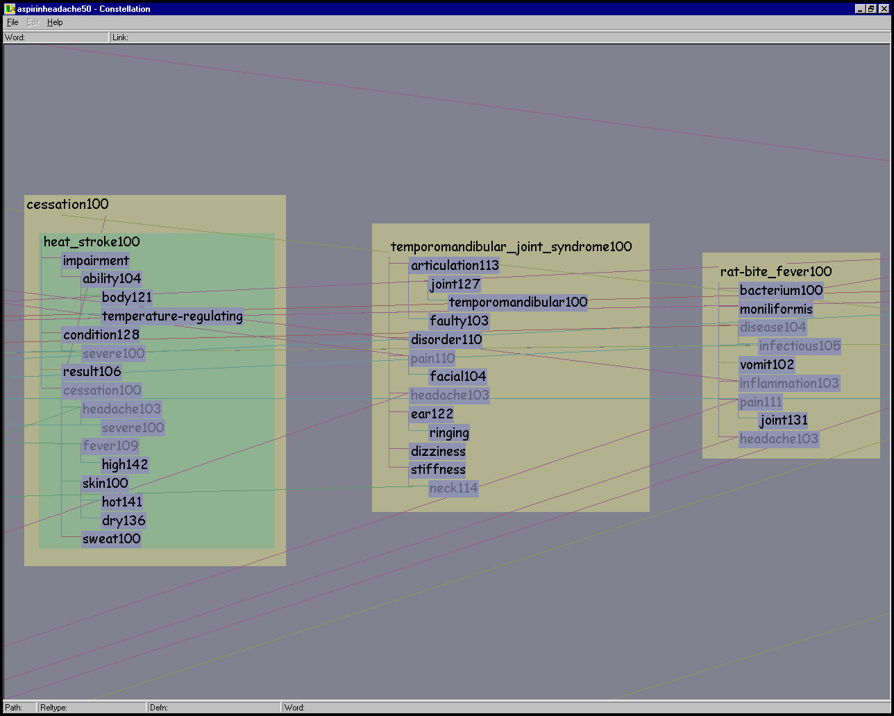
Our description of the layout algorithm has thus far been in terms of the domain-specific structures of paths and definition graphs. We can also describe the problem in more abstract graph-theoretic terms. The query results from MindNet form a directed graph of between a few hundred and a few thousand nodes. The observed edge density has been |E| <= 3|V|. Each path is a linear directed graph: i nodes connected by links, where each node has indegree and outdegree 1, except that the source node has no incoming link and the sink node has no outgoing link. Observed values for i range between 2 and about 8. The number of paths is explicitly requested by the user, and typical values are 10 and 50. These linear graphs can be combined based on shared nodes, but there is no guarantee that the result will be a single connected component.
The nodes in this combined graph are the path segments, which are drawn as variably-sized tan boxes with the pathword label in the upper left corner. These level 0 nodes can contain two levels of nested subgraphs. The first nesting level has a simple structure: there are j level 1 subnodes, where j varies between 1 and about 20. Each level 1 subnode corresponds to a single definition graph and is drawn as a green box of nonuniform size, with a headword label in the upper left corner. These nodes are all drawn nested within the boundaries of the tan level 0 box. Each of them has indegree 1 and outdegree 0, connected to the level 0 node but not to each other.
Finally, each of these level 1 nodes contains an entire nested subgraph, the definition graph itself, where each of the k level 2 nodes corresponds to a word in the definition. Observed values for k range between 2 and 20. These level 2 nodes are drawn nested inside the green box of their parent level 1 node. The level 2 nodes of a definition graph subgraph are a single connected component, and the node placement within the rectangular allotted space depends on the link structure of that subgraph. At least one level 2 (word) node per level 1 (definition) node is connected to the enclosing level 0 (pathword) node.
The base graph layout algorithm involves only the level 0 path segment nodes and the links between them. The second pass for maximizing information density tries to optimize the size of the level 0 enclosing node based on the size of the combined level 1 and 2 subgraphs.
In the Constellation layout algorithm, we completely ignore the set of links between a level 2 word node and all other nodes that have the same label. However, these links are always drawn. This approach is similar to the H3 layout algorithm, where the set of links that do not appear in the computed spanning tree does not affect the node layout decision. The difference lies in the drawing: in H3, these links are drawn only on demand, and usually only a subset of them are drawn at once.
The boxes allocated for words determine the font size that can be
used to draw their labels. We always use a canonical stand-in word for
the font size computation instead of the actual character string. (We
discuss this design choice in detail in Section 6.1.1
on page ![]() .) Our stand-in word ``Etaoinshrd100''
is made from the first ten most commonly occurring characters in the
English language combined with a word sense number. The correct
distribution is important since we use a variable width font. The
length of the stand-in was chosen empirically.
.) Our stand-in word ``Etaoinshrd100''
is made from the first ten most commonly occurring characters in the
English language combined with a word sense number. The correct
distribution is important since we use a variable width font. The
length of the stand-in was chosen empirically.
When the real label requires more horizontal room than is available in the box, we elide it to fit. For instance, the top left of Figure 5.14 shows an entire dataset at the global overview level, and the label ``Old_English_Sheepdog100'' in the lower left path segment is drawn as ``Old_English_sh.100''. The traditional three dots used to signal ellipsis takes more horizontal space than most single characters, so we instead use a single dot.
Constellation is optimized for three viewing levels: a global view for inter-path relationships, a local view for reading individual definition graphs, and an intermediate view for associations within path segments. These differing emphases are all accomplished by making the amount of vertical space devoted to classes of words depend on the current zoom level. This adaptive word layout is a form of continuous multiscale navigation, albeit a less drastic one than the extreme approach taken in the Pad++ system [BH94].
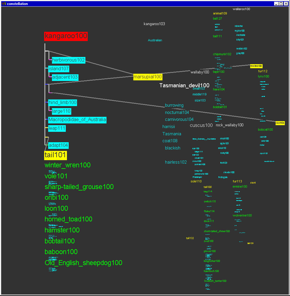
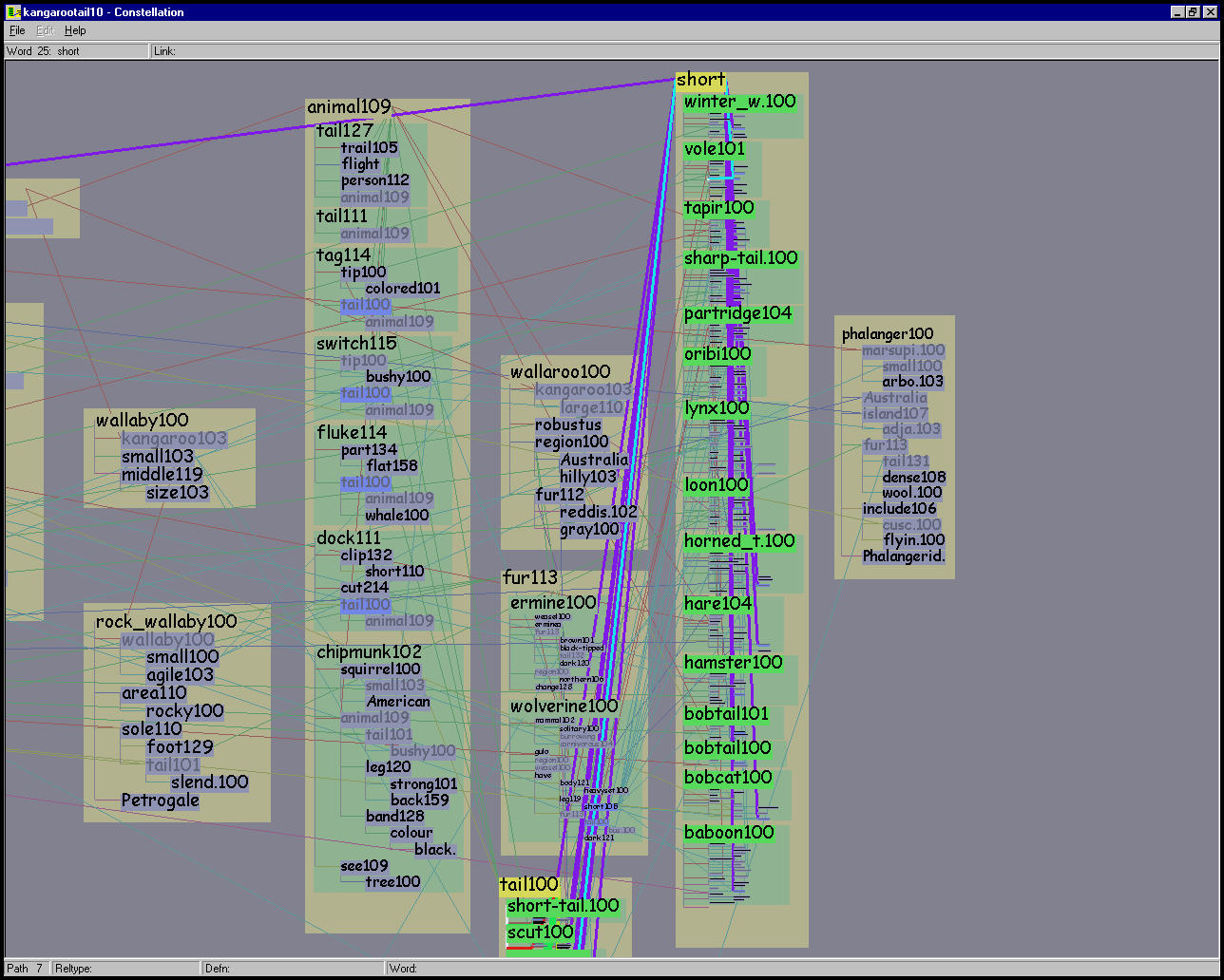
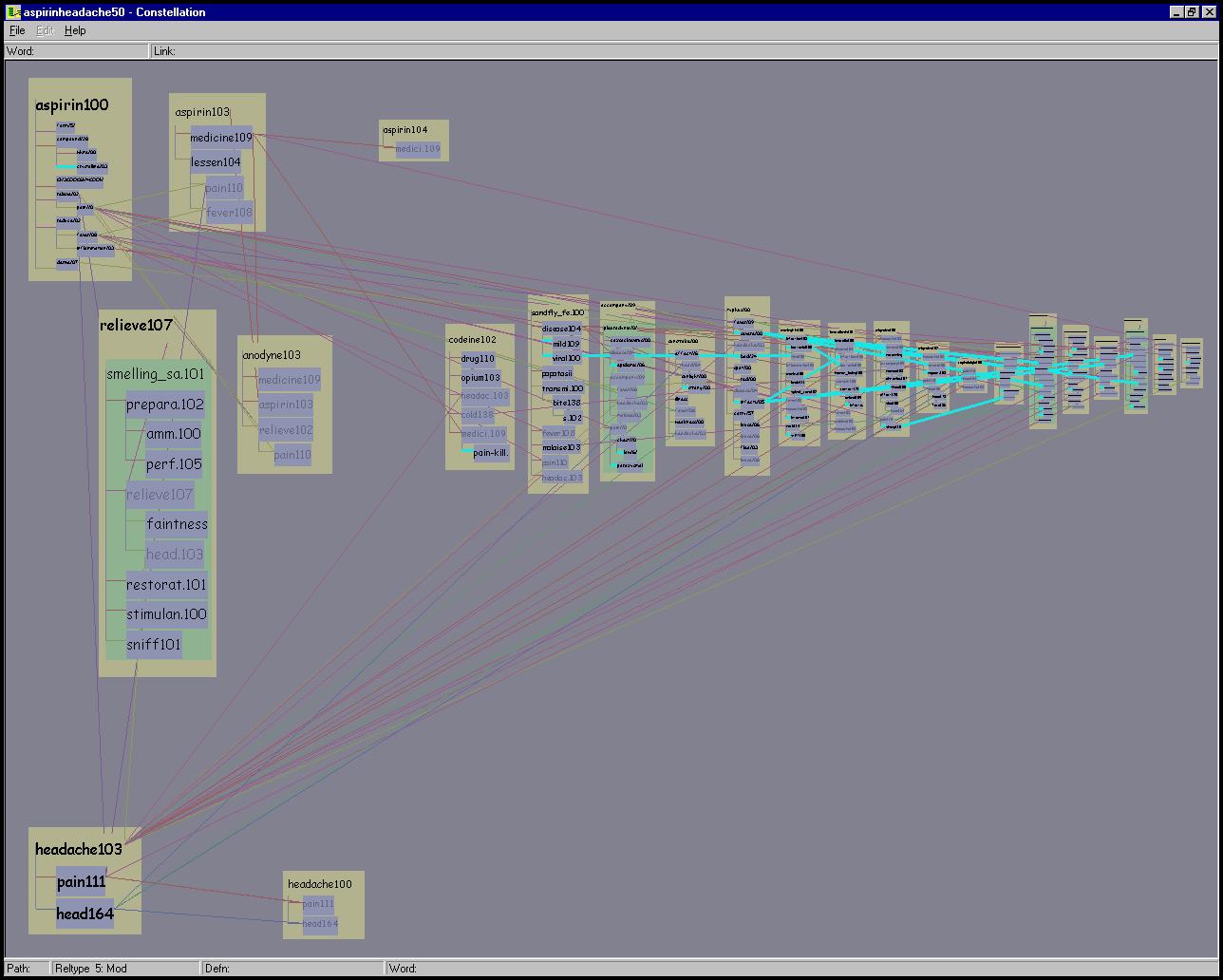
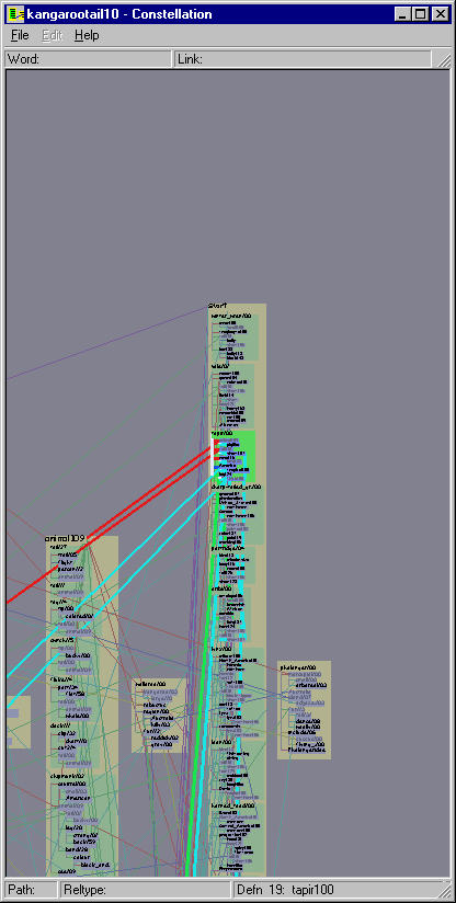
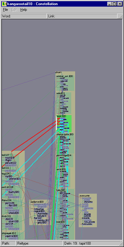
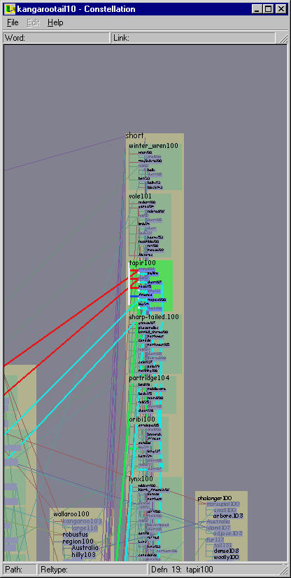
Figure 5.14: Viewing levels. Top Left: The overview level is optimized for showing global path structure, and the inset shows that in this case leafword text may be omitted completely. In this 10-path KANGAROO TAIL dataset all instances of TAIL101 are marked by the hovering cursor. The highlighted path 5 constellation shows that many green definition graph boxes are associated with the pathword ANIMAL109. Top Right: We avoid sudden jumps in visual salience with a greeking step between the complete omission of leafword text and the smallest size text font. In this 10-path ASPIRIN and HEADACHE dataset, the first path constellation is highlighted, and all instances of the word FEVER108 are marked by the hovering cursor. Bottom left: The definition graph reading level is shown for the same area as the inset above, and the different aspect ratio allows every word in the tan boxes to be easily readable. Bottom right: The intermediate path segment viewing level is shown with path 7 highlighted, emphasizing the legibility of the definition graph headwords at the top of each green box.
The overview level is optimized for showing global path structure, so that pathwords and headwords are emphasized at the expense of leafwords. That is, a relatively large part of the available vertical box space is devoted to the pathword, then much of the remaining goes to the headwords, and finally all the leafwords are then fit into a small amount of vertical space. In cases of extreme vertical crowding, leafword boxes are still drawn but the text is omitted completely, as shown in the inset of the top left of Figure 5.14.
An earlier version of the system would suddenly switch from omitting
leafwords to drawing them at the smallest font level possible, which
resulted in a visually obtrusive jump during zooming because of the
sudden appearance of large amounts of dark pixels. The top right of
Figure 5.14 shows the intermediate
greeking![]() state in
the inset that is built into the final version of Constellation, where
we draw one-pixel high black lines to visually smooth the transition
between total omission and text drawing with the smallest font. We
always draw the rectilinear ladder links, since when they are not
highlighted they are visually unobtrusive and when they are
highlighted they are explicitly intended to stand out.
state in
the inset that is built into the final version of Constellation, where
we draw one-pixel high black lines to visually smooth the transition
between total omission and text drawing with the smallest font. We
always draw the rectilinear ladder links, since when they are not
highlighted they are visually unobtrusive and when they are
highlighted they are explicitly intended to stand out.
The local viewing level was optimized for easy reading of definition graphs when zoomed in, and the allocation of vertical space is more equal between headwords and leafwords. The bottom left of Figure 5.14 shows that at high enough zoom levels, enough horizontal room is available to draw the full label for every word. The aspect ratio of the window is accordingly quite different from the equivalent area in the inset above it.
The path segment viewing level is optimized for showing the attachments between definition graphs and pathwords. In this intermediate stage between the global and local view, the size of headwords is close to that of pathwords. The bottom right of Figure 5.14 illustrates that framing an entire path segment with many associated definitions in the window results in much of the green box space being devoted to the definition graph headwords.
The zoom level is taken into account in the layout of words in a path segment. Since the layout inside a path segment changes when the zoom level does, it must be quickly computable to retain the reactive fluidity that is an important component of the visualization system. The mechanism for this proportional allocation of space is to simply put a maximum cap on the font size but allow differential scaling in the horizontal and vertical directions. The visual result is that as the zoom level increases, the proportion of room allocated to the pathwords and headwords decreases while that of the leafwords increases. When the user is looking at a definition close up, every word in the definition graph is large enough to read in almost all cases.
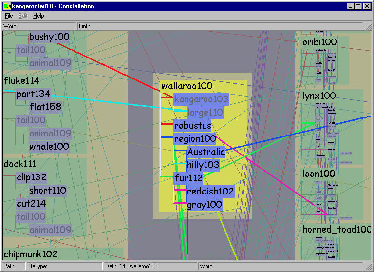
The previous section describes the use of quantitative spatial position to encode plausibility and proximity to encode association. We also allow exploration of the dataset through the selective highlighting of constellations of boxes and edges. We carefully chose perceptual channels so that information is never hidden but highlighted constellations are easily discernible.
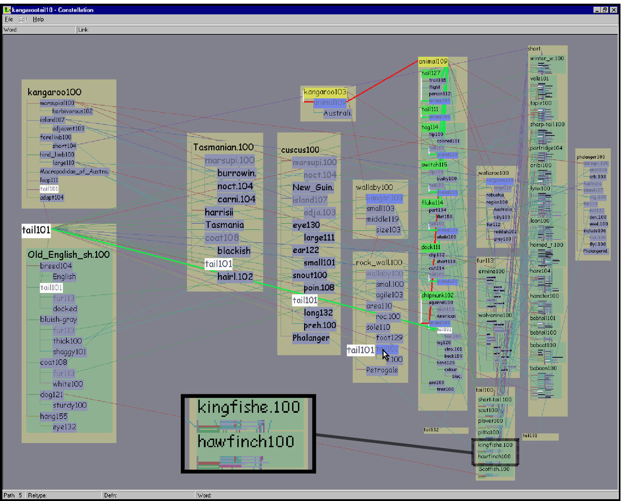
There are four constellation types: paths, definition graphs, words, and relation types.
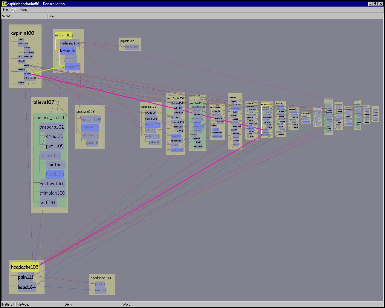
A path constellation highlights every word on a path and the links
between them, as in the top left of Figure 5.15. In
path constellations, all other versions of a highlighted word have
subtle highlighting on their label boxes, but we do not explicitly
emphasize the connecting links between master and proxy versions of
the word. The relationship between a path and its constituent
definition graphs can be quite complex. The top left of Figure
5.14 shows the constellation for the path
{kangaroo103  animal109
  tail101}, which
visually reflects that the connection between ANIMAL109
and TAIL101 is due to a derivation by MindNet involving several
definition graphs.
tail101}, which
visually reflects that the connection between ANIMAL109
and TAIL101 is due to a derivation by MindNet involving several
definition graphs.
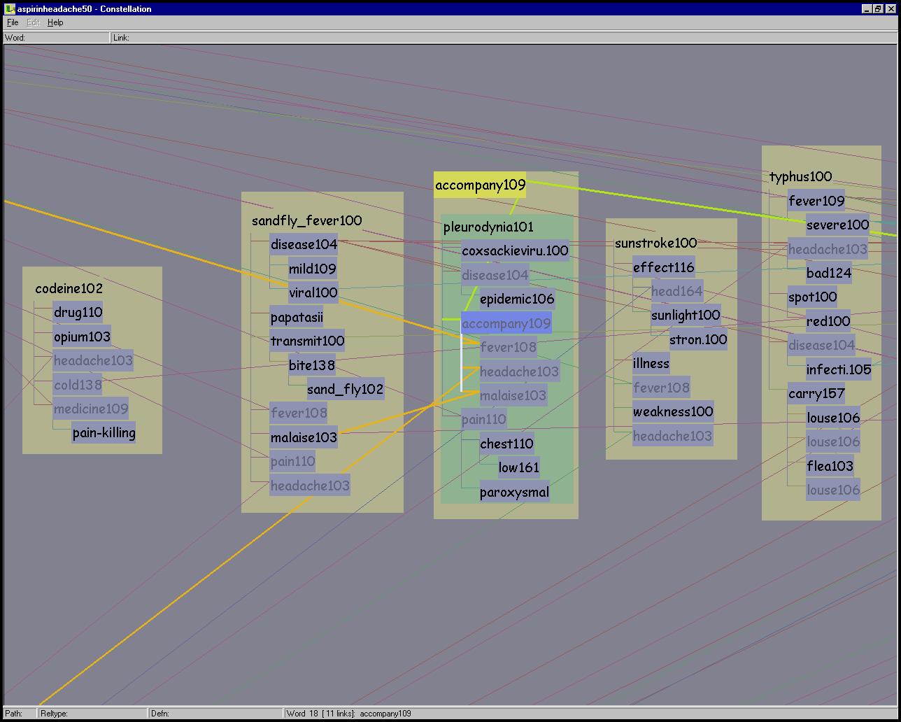
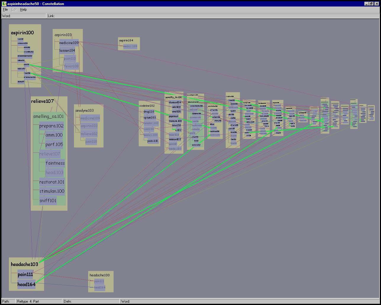
Figure 5.15: Constellations. Top Left: Path 37 of the ASPIRIN-HEADACHE 50 path dataset is highlighted. Top Right: The definition graph for ASPIRIN100 is highlighted here. Every long-distance link between a master word in that constellation and all its proxies is also highlighted to underscore the relationship of the shared words. Bottom: The constellation of all words connected to ACCOMPANY109 is highlighted in this partially zoomed-in view.
Figure 5.16: Relation type constellations. Dataset of the first 50 aspirin-headache paths. Top Right: All relations of type part-of are highlighted in green. Top Left: All relations of type transitive object are highlighted in yellow. Bottom: All relations of type modifier are highlighted in cyan.
A definition graph constellation highlights every word in a definition graph, the local axis-aligned links between those words, the long-distance slanted proxy links between every instance of those words, and the enclosing box. The top right of Figure 5.15 shows an example. A word constellation highlights a single word, all words directly connected to it via a relation, and the links in between, as in the bottom of Figure 5.15. If any of the highlighted words in a word or definition graph constellation appears in more than one place, every instance of it is highlighted, as are the links between all versions of that word. The final constellation category, relation type, highlights only the lines representing the relations of a particular category. Figure 5.16 shows several examples. Also, many additional figures throughout this chapter show constellations.
Figures 5.11 and 6.2 (page
![]() ) show previous versions of our
system that implemented constellation emphasis by simply showing and
hiding sets of nodes and edges. The danger of such filtering is that
it introduces hidden state: users can easily forget the exact choices
they made in the past that affect the current display. They might then
reach a conclusion that is unwarranted given the true characteristics
of the data, by drawing inferences from a subset rather than all of
the data. In the final version of our system, user navigation is the
only reason that all the information might not visible at all
times. We solved the problem of visual clutter by the careful use of
several perceptual channels to distinguish between emphasized and
unemphasized information.
) show previous versions of our
system that implemented constellation emphasis by simply showing and
hiding sets of nodes and edges. The danger of such filtering is that
it introduces hidden state: users can easily forget the exact choices
they made in the past that affect the current display. They might then
reach a conclusion that is unwarranted given the true characteristics
of the data, by drawing inferences from a subset rather than all of
the data. In the final version of our system, user navigation is the
only reason that all the information might not visible at all
times. We solved the problem of visual clutter by the careful use of
several perceptual channels to distinguish between emphasized and
unemphasized information.
Although no other perceptual channel alone is as salient as spatial position, combining several of them has proved to be highly effective at creating visual popout to distinguish a foreground from a background visual layer [Tuf91]. The background layer with its many edge crossings is visible at all times for context, but is unobtrusive since the background boxes and lines have low saturation and their brightness is quite similar to that of the background color. We emphasize the foreground layer by increasing both saturation and brightness. In the case of lines, we also increase the size because hue differences in wide lines are much more discriminable than in the unhighlighted narrow ones.
The colored text background boxes inside the path segment boxes (as in Figure 5.9) use grouping and enclosure to encode the hierarchical relationship between pathwords and definition graphs. These boxes also provide a colored area large enough for effective hue discrimination and maximize the legibility of the black label text. The long slanted lines between master and proxy instances of the same word sense encode association with a connection cue. The orientation of a line is an additional perceptual cue for an additional orthogonal layer, since all local definition links are axis-aligned and only long-distance proxy edges between shared words are slanted.
Finally, we use hue as a nominal variable, to distinguish between the types of enclosure boxes and the types of relation lines. Each of the eight relation types is color coded with with hues 45 degrees apart on the HSB color wheel, whereas the three hues for the enclosure boxes (tan, green, and blue) were empirically chosen to complement them.
| Shape | Instance | Color | Hue | (R,G,B) | |||||||||
|---|---|---|---|---|---|---|---|---|---|---|---|---|---|
| Dim | Bright | Dim | Bright | Lines | is-a | red | 0 | 40,60 | 90,90 | 153, 92, 92 | 229, 25, 25 | ||
| subject | orange | 45 | 153, 139, 92 | 229, 178, 25 | |||||||||
| object | yellow | 90 | 139, 153, 92 | 178, 229, 25 | |||||||||
| part-of | green | 135 | 92, 153, 107 | 25, 229, 76 | |||||||||
| modifier | cyan | 180 | 92, 153, 153 | 25, 229, 229 | |||||||||
| location | blue | 225 | 92, 107, 153 | 25, 76, 229 | |||||||||
| join | purple | 270 | 122, 92, 153 | 127, 25, 229 | |||||||||
| other | magenta | 315 | 153, 92, 138 | 229, 25, 178 | |||||||||
| Boxes | path | tan | 60 | 20,70 | 50,90 | 178, 178, 143 | 214, 217, 87 | ||||||
| definition | green | 125 | 143, 178, 145 | 87, 217, 92 | |||||||||
| leaf | blue | 235 | 143, 147, 178 | 115, 134, 229 | |||||||||
| Other | background | grey | 240 | 48,122 | 0,0 | 129, 129, 143 | 0, 0, 0 | ||||||
| text | grey | 166 | 100, 103, 123 | ||||||||||
| pie flipper | grey | 240 | 10,70 | 10,80 | 161, 161, 179 | 179, 179, 199 | |||||||
Table 5.1: Color scheme used for the visualization, in both HSB and RGB. Each relation type is coded with hues 45 degrees apart on the HSB color wheel, and the hues for word types were empirically chosen to complement them. The highlight colors are obtained by increasing both the saturation and brightness. Hues range from 0 to 360, saturation and brightness range from 0 to 100, and red/green/blue values range from 0 to 255.
The Constellation color scheme was designed by Guimbretière. He drew heavily on ideas from Reynolds [Rey94], who presented a set of color palettes to improve the legibility of air traffic control displays. We summarize the guidelines used to construct the color palette in Table 5.1:
The two main interaction techniques in Constellation are navigation and interactive visual emphasis through selective highlighting.
The previous section discusses the use of multiple perceptual channels to bring a particular subset of the data to the emphasized foreground visual layer. This interactive visual emphasis is similar in spirit to the dynamic queries of previous information visualization systems such as FilmFinder [AS94].
An early prototype of our system allowed the user to flip through instances of constellation categories by hitting keyboard keys. Our users found that it was difficult to keep track of which key would do what. Guimbretière designed an interface that would allow them to choose between possibilities without the cognitive burden of remembering. Some kind of menu is the obvious solution to this problem.
He chose to use the hardware affordances of the now-common scrolling mouse: a mouse with a small wheel between the main buttons that offers an additional linear control channel independent of the x-y positioning. Our user community is small enough that we can simply assume that they all have such a mouse.
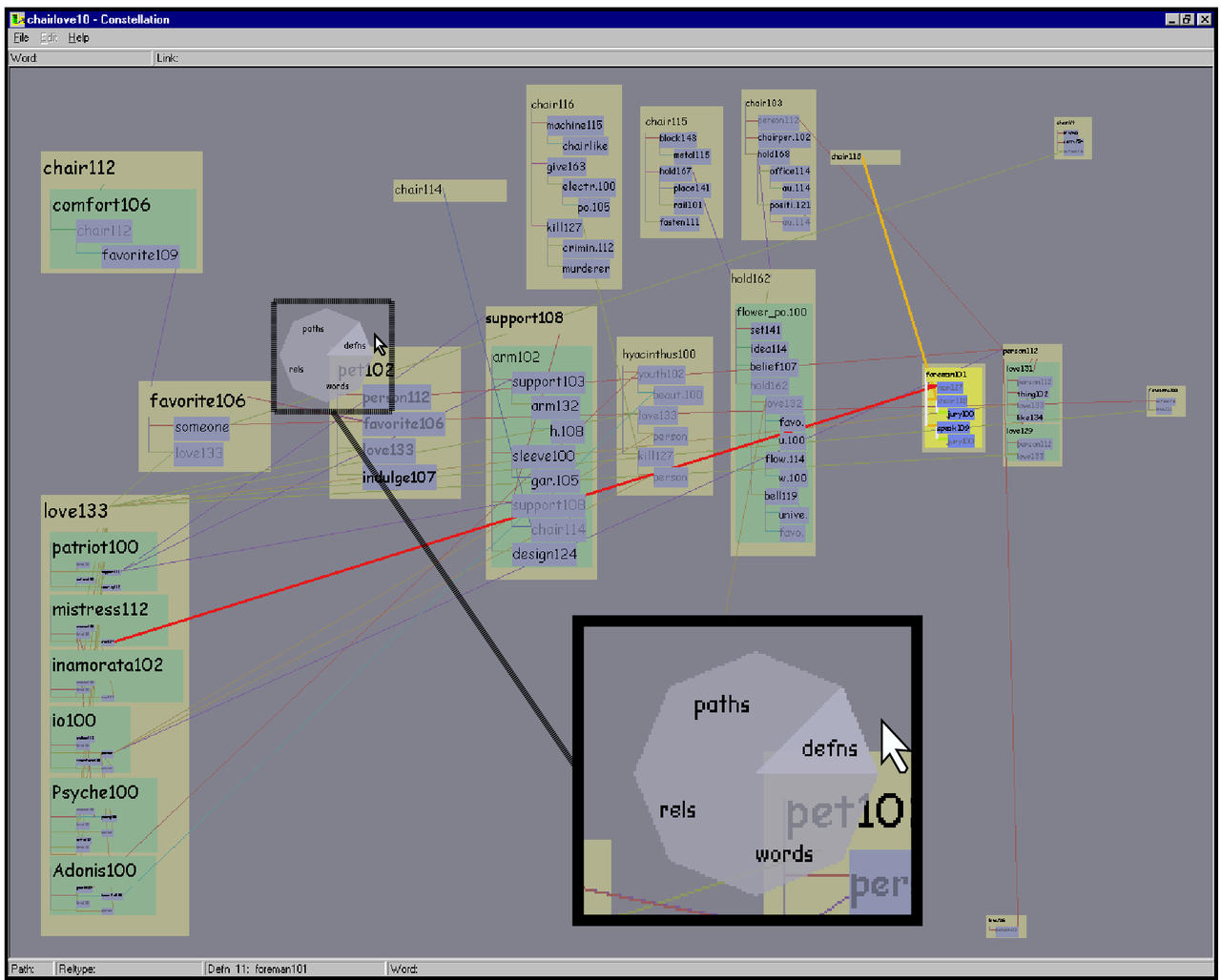
In the current version, the user brings up his new pie flipper interface by holding down the right mouse button, which triggers the translucent radial popup display shown in Figure 5.17.
Figure 5.17: Pie flipper. The inset shows a translucent radial popup display for flipping between the instances of constellations in a category. The FOREMAN101 definition graph constellation is being chosen in the CHAIR-LOVE 10 path dataset.
Holding a mouse button down and dragging the cursor into a slice picks a category type, and then scrolling the wheel (with the button still held down) selects instances in that category. If the user drags the mouse over to a different radial slice, the constellation category changes accordingly. When the user releases the mouse button, the radial display disappears and the flipping operation is terminated, leaving the last-chosen constellation highlighted. The scrollwheel can be used both to quickly spin past many choices and to flip between constellations one by one using the subtle detents on the wheel. Visual feedback is provided by both the selective highlighting visible in the main window through the translucent popup, and auxiliary information in a lower status bar. If the initial mouse click is over a word instead of the background, then the word and definition constellation slices act as toggles for that word instead of flipping through all possibilities.
The pie flipper is similar to a pie menu [CHWS88] in that it has a pie chart layout on a popup menu, but it does not directly trigger an action. Instead, it allows the user to temporarily enter a mode that controls their category choice. Mode errors are minimized because of the sensory feedback of actively holding down the mouse button [SKB92]. Radial pie menus allow faster selection than linear ones [CHWS88], and the translucent popup provides a minimal screenspace footprint. Another reason that he chose to use a popup menu instead of a fixed menu location at the top of the window was so that constellation flipping would be extremely lightweight and not require any distracting mouse motion.
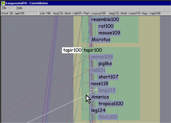
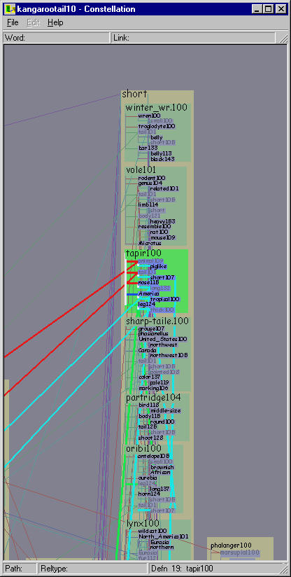
Our extremely lightweight hover mode allows quick visual inspection with no need to navigate. In hover mode, simply moving the mouse over a link marks it visually and shows full details about its origin and destination in an upper status bar. This functionality, shown in Figure 5.18, was added after a direct request from the linguists, who wanted to see offscreen information without needing to navigate there and back when zoomed in to read a definition graph. Hovering over a word will temporarily draw it at maximum size so that it is legible even from the overview position, and visually mark all proxy versions of the word by drawing their label backgrounds as white instead of blue. Again, the linguists requested this functionality to aid reading while avoiding navigation. They wanted to study shared word relationships from the overview position without zooming in to read small words. The large word is drawn to the left of the box so that the large word does not occlude the words directly below the highlighted one, as in Figure 5.14.
Figure 5.18: Hovering. Holding down the shift key enters the lightweight hover mode, where simply moving the mouse both visually marks it in white and yields more information about the object beneath it. Moving the mouse over a link marks it and shows detailed information about its origin and destination in an upper status bar. The mouse is also inside the green definition box for TAPIR, so it is marked by being drawn large on the left. If there were multiple instances of the word, all would be marked, as in Figures 5.14.
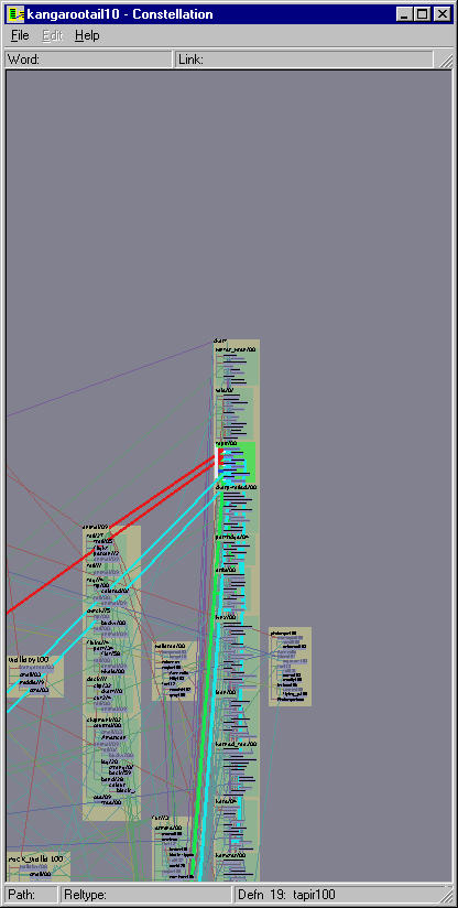
Figure 5.19: Zooming. This zoom sequence centered on TAPIR100 shows the adaptive layout in action.
The main navigation method is a mouse click inside any enclosure box, which triggers an animated transition. Such transitions are important for helping the user maintain mental context [RCM93], which is especially important in our system since zooms usually entail nonrigid motion. The horizontal and vertical zoom scales are computed separately, so that the enclosing box is vertically framed within the window and there is enough horizontal space to to draw every character in all the enclosed labels without elision. Thus a simple click in a definition graph box guarantees that every word in an entire definition is easily readable. The differing aspect ratios of equivalent regions of the screen depending on the zoom level is visible by comparing the global view at the top left of Figure 5.14 to the view after an animated transition shown below it.
A click in a path segment box will guarantee that every headword is in the field of view, and in most cases that at least every headword is large enough to read. The bottom right of Figure 5.14 illustrates the resulting view.
Mouse dragging offers the user direct control over panning and zooming. The pan control is a left mouse drag. Zooming is either continuous through a right mouse drag when the control key is held down, or in discrete increments using the mouse scrollwheel detents. Figure 5.19 illustrates the gradual change in relative word sizes during a long zoom sequence.
Constellation is implemented in C++, using OpenGL for drawing. Since MindNet runs only under Microsoft Windows, Constellation was also developed under Windows.
We implemented several optimizations to speed up the interaction. We avoid the slower immediate-mode drawing in favor of a using single cached large display lists whenever possible, for example when the user pans or triggers the transparent popup pie flipper. When user actions change the appearance of the window, for instance through selective highlighting, then we must create a new display list. The most expensive operations are zooming or changing the window size: these operations require recomputing the path segment spatial layout in addition to a redraw. The segment layout recomputation is necessary since the relative allocation of space on the screen inside the boxes depends on the zoom level. However, the curvilinear grid layout and vertical cell expansion happens only once per dataset.
With a sufficiently fast graphics card and PC, the frame rate remains interactive even in the worst case of redraw plus replace, but the optimizations result in smoother interaction in the other cases. We did not spend a great deal of time optimizing the drawing, instead focusing our attention on the iterative design of the rest of the system. This allocation of resources seemed reasonable given that our very small user community of researchers is quite well funded, and graphics card price and performance continue to improve rapidly.
We first cover the design tradeoffs of the project, then present the visual appearance of example datasets. Finally, we discuss the reasons for the project outcome, since Constellation is not in active use by our small target audience of computational linguists.
Our final layout algorithm is the result of many iterations as we explored the tradeoff between legibility and the semantic use of space on a finite resolution display. At the former extreme, we could tile the window with a rectangular grid containing 300 words, but there would be no spatial encoding whatsoever. At the latter extreme, a very strict spatial encoding (as in Figures 5.12 or 5.13) would allow an exact encoding of the desired attributes, but vast amounts of navigation would be required to do much reading because of low information density. Our horizontal plausibility gradient is a middle ground where more important words are allocated more room in the overview position. The transformations from the sparse to the dense grid work well because they preserve the ordinality of the bands and pathwords, which is our main concern for this task.
To compensate for our finite resolution, we offer easy navigation with animated transitions and intelligent zooming, where the relative amount of space devoted to words changes based on the zoom level. Rapid visual emphasis through hovering is useful in situations where navigation would be a cognitive burden.
The layout provides a great deal of structural information about the paths and definitions that were returned by a MindNet query, at the expense of many edge crossings. Our visual layering approach of using many perceptual channels in concert proved to be quite effective at both avoiding false edge attachments and visual emphasis. The psychophysical literature on color coding is extensive [War00, Chapter 4,] [RT96], and we benefited from it by following recommendations of Reynolds [Rey94].
Figure 5.20: Three effective viewing levels. Top: The global overview is effective for inter-path comparison. Middle: The intermediate view shows the definition graphs associated with a path word. Bottom: The closeup view allows the linguists to read an individual definition graph.
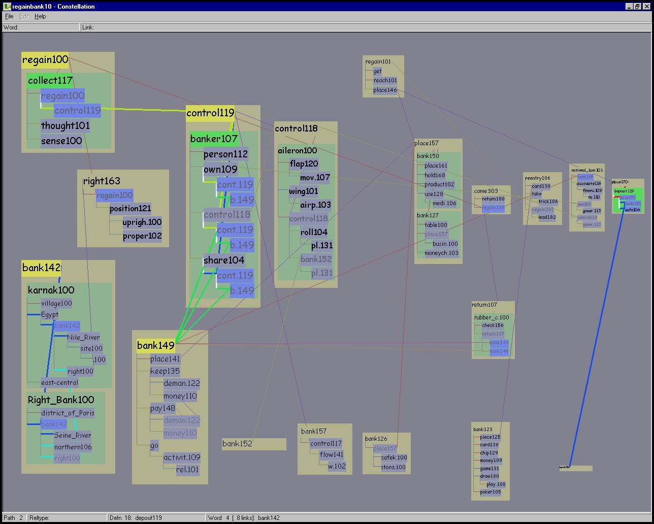
Figure 5.21: Dissimilar query words. The query words REGAIN and BANK are dissimilar, so there are few shared words. Three constellations are composed: path 2, a green definition graph for DEPOSIT119 on the far right, and words connected to BANK132 on the far left.
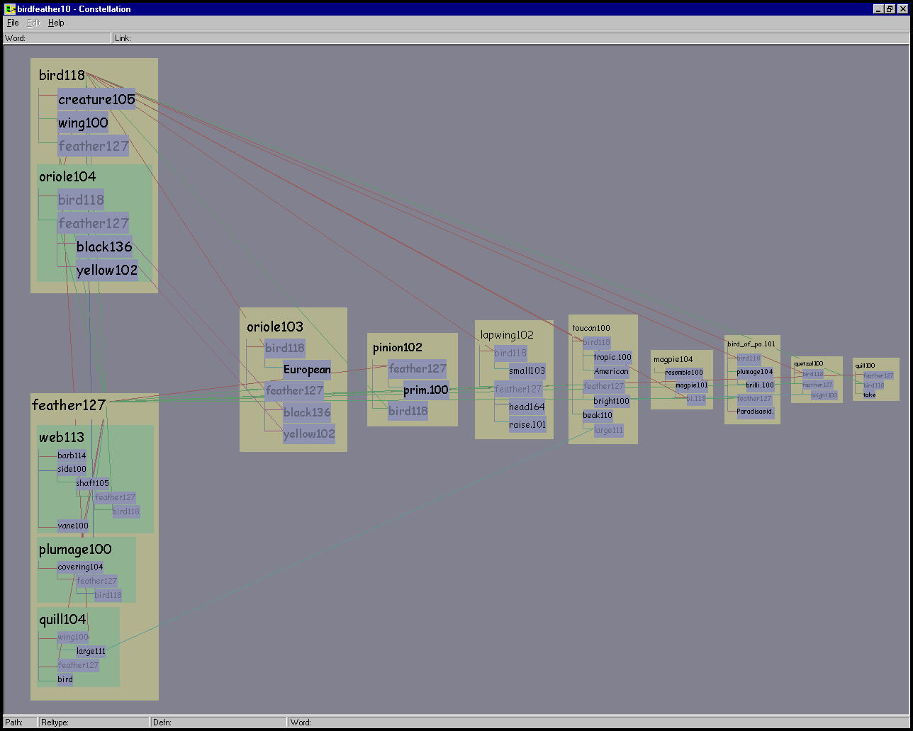
Figure 5.22: BIRD-FEATHER 10 path dataset. The strongly associated words BIRD and FEATHER results in a long characteristic T shape using our layout algorithm.
Figure 5.20 shows that we succeeded in creating a layout that was effective at three different viewing levels that corresponded to the three targeted subtasks: a global overview for inter-path comparison, an intermediate view to inspect the definition graphs associated with a particular pathword, and a closeup view well-suited for reading individual definition graphs. Reading the definition graphs, which correspond to a dictionary entry, is a critical part of the plausibility-checking task.
Our spatial layout provides insight into the similarity between the words of the initial query from the global overview level. Figure 5.22 shows the 10 path BIRD-FEATHER dataset, which has the typical sideways ``T'' shape formed by strongly associated words. The words REGAIN and BANK are quite dissimilar, so there are not many long-distance proxy links in Figure 5.21.
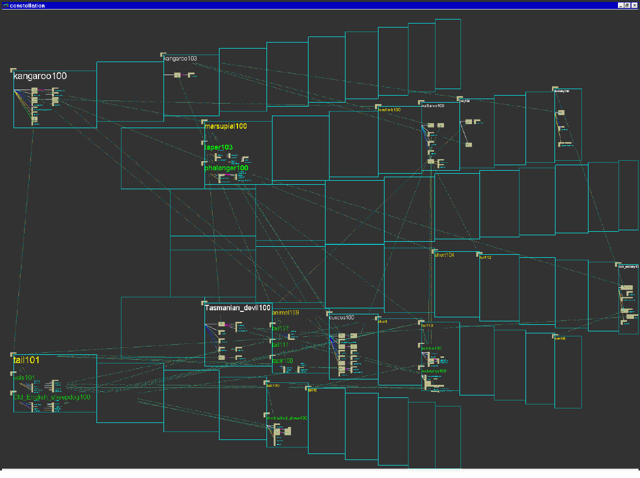
Figure 5.23: Layouts of kangaroo-tail dataset using pre-existing systems. Left: Layout using dot, one of the more flexible and scalable 2D graph layout systems. Right: Layout using our H3 system. Neither layout is effective for a linguist making plausibility judgements about paths or reading individual definition graphs.
The efficacy of the Constellation views is clear when compared to other pre-existing views of the same dataset. We found that relying on generic graph layout techniques to display this complex structure led to inadequate results. Figure 5.23 left shows part of the kangaroo-tail dataset laid out using dot [GKNV93], one of the more flexible and scalable 2D graph drawing systems. Figure 5.23 right shows the same dataset laid out in H3. Both views show an aspect of the graph structure, but neither are suitable for making plausibility judgements about paths by reading individual definition graphs.
Constellation is not in active use by our small target group of linguists, whose project goals shifted during the time that we built the visualization system.
Our target group was quite available during the first phase of the project when I was a summer intern at Microsoft Research in 1998. My coauthor and I were able to obtain more feedback on later prototypes during several visits to MSR over the course of the next year. Unfortunately, by the summer of 1999, the project goals of the linguists had shifted as new aspects of their research came to the fore, and plausibility checking was no longer a major task.
Although Constellation was designed for a small target audience, our design principles are relevant for many information visualization systems. The interactive visual emphasis capability is as fundamental to the dataset exploration as the interactive navigation, and these interactions are as important as the base spatial layout for understanding the full dataset. In this chapter we have presented a very detailed analysis of our design choices by justifying them against the task requirements. We have also documented some of the ways that the current version of the software differs from previous iterations as a result of informal usability observations of the linguists working with the earlier prototypes.