In the previous chapters we have covered the design of three software systems. In this one we discuss some general points that pertain to all three. We then present some ideas for future work: first, specifics that are more tied to each individual system or problem domain, and then, higher-level thoughts about the field of information visualization. We finish with concluding remarks.
Four discussion points that pertain to more than one of the systems in this thesis are visual popout, hidden state, ordering encoding, and dissemination.
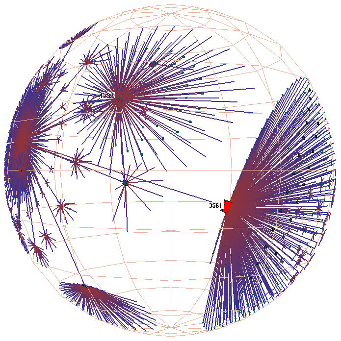
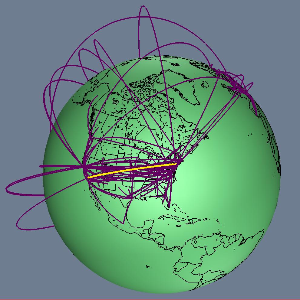
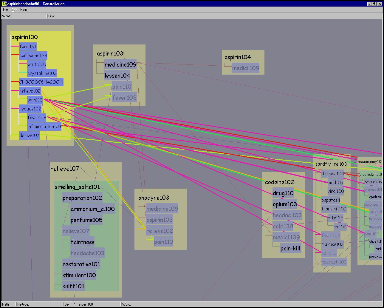
Figure 6.1: Visual popout. Left: In H3 the aggregate blobs on the fringe pop out, showing distant points of possible interest. Middle: In Planet Multicast the long distance tunnels are the most visually salient. Right: In Constellation the foreground layer pops out from the background layer because of the deliberate design decision to use multiple perceptual channels in concert.
In section 1.2.3 we introduced the idea of preattentive visual processing and visual popout. We now discuss the ways in which the visually salient features of all three systems match our original design goals, shown in Figure 6.1. In the H3 system, our spatial layout was primarily aimed at maximizing the size of the local neighborhood visible at any given moment. The distortion-based layout provides a smooth visual gradient between a focus area with visible detail and the areas near the fringe of the ball that show only aggregate information about the existence or nonexistence of structures. These distant points of complexity are visually salient as blobs on the fringe, which is useful when the user is navigating through an unfamiliar graph structure seeking places of possible interest. In the Planet Multicast system, we explicitly tie tunnel height to geographic distance, so that the lofted arcs of the long distance tunnels visually pop out. The salience match is good when our assumption that geographic distance is correlated with resource usage holds true. In the Constellation system, we deliberately designed an interaction mechanism that results in a foreground layer popping out from a background layer, which was discussed in detail in Section 5.4.1.
The three preceding cases highlight positive examples of our design, where we successfully encoded the intended domain semantics into visually salient features. We also have to evaluate our visual encoding choices to ensure that we do not inadvertently lead the viewer astray: ``... inappropriate perceptual organization can lead to false graphical implicatures if the viewer is led to draw incorrect inferences due to the presence of misleading perceptual groupings or orderings.'' [Mar91, p. 400,]
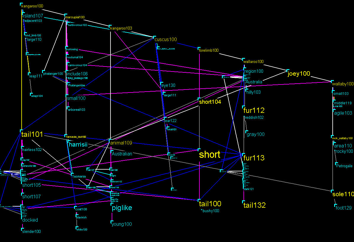
Figure 6.2: Avoiding visual artifacts from word sizing. Top: A very early layout attempt that led the linguists to incorrect conclusions. Bottom left: The word SHORT contains fewer letters than the word FORELIMB100, so a larger font fits in the allocated space. Bottom right: Words of the same computed importance are always drawn the same size in the final version.
One of the earlier prototypes of the Constellation system had a visually salient artifact that caused the users to draw the wrong conclusion. Figure 6.2 shows the problem: the word SHORT is much larger than the word FORELIMB100, which was a misleading visual cue that led the linguists to infer that one word was more important than the other. However, these two words have the same computed importance: the size difference was caused by the irrelevant fact that one word had several more letters than the other. The original drawing algorithm made font size decisions on a word by word basis, where we used the largest font that would fit into the allocated screen area for that word. Although this decision had seemed reasonable when we were focused on maximizing information density, after observing the linguists using the prototype we switched to the algorithm discussed in section 5.2.9, where words of the same importance are guaranteed to be drawn the same size. In this more sophisticated multiscale layout algorithm, we achieve high information density by changing the relative word size in response to user navigation, as in section 5.2.10, while avoiding visual artifacts.
In the previous section we discussed the possibility that visually salient
artifacts could lead to false positive conclusions. The inverse
problem is also possible: leading people to draw false negative
conclusions. People have a tendency to assume that only objects that are
visible exist, a phenomenon called the closed-world assumption
[Lev88].![]() Researchers investigating human perception of drawn graphs
have also noted this phenomenon: ``The absence of any of the above features
is interpreted semantically as the absence of the interpreted
quality.'' [DC98, p. 442,] The lesson that we could apply to
the design of visualization systems is that hidden state can mislead
the user.
Researchers investigating human perception of drawn graphs
have also noted this phenomenon: ``The absence of any of the above features
is interpreted semantically as the absence of the interpreted
quality.'' [DC98, p. 442,] The lesson that we could apply to
the design of visualization systems is that hidden state can mislead
the user.
Despite the dangers, many visualization systems have hidden state, including Planet Multicast and H3. In H3, all non-tree links are explicitly filtered by default, and only a subset of them are usually drawn at once. In Planet Multicast, hidden state is implicit since tunnels within the same city are never drawn. As usual, visualization system designers are faced with a tradeoff: in many cases the benefits of visual filtering are arguably worth the risks of hidden state.
In the final version of Constellation, we completely avoid hidden state. We respond to user choices by toggling the visual salience of objects between emphasized and unobtrusive, but nothing is ever completely hidden. In earlier versions we simply toggled between drawing and hiding the objects in response to user interaction. We noticed the difficulties presented by this hidden state when observing the user of the prototypes by our target users. The linguists had a tendency to forget previous mode-changing actions, and so would draw false negative conclusions since parts of the dataset had been temporarily hidden. Our more sophisticated selective emphasis scheme in the final version successfully avoided this source of confusion.
The three systems each fall into a different class of semantic power with respect to the visual encoding of ordering semantics. The MBone tunnel dataset does not contain any sort of explicit visual ordering, so the geographic layout of the Planet Multicast system makes no attempt to visually communicate ordering.
In contrast, the Constellation dataset has several orderings: the high-level path structures have an explicit ordering, as do the low-level structures inside each definition graph. The path ordering is linear, and is visually encoded by horizontal band placement. The internal definition graph subgraph structure is hierarchical, and both parent-child and child-child ordering is important. To expand on the latter point, the children of a node have a specific sibling order. The related domain-specific fact is that reading the definition graph text is an important subtask, and English has very strong top-to-bottom, left-to-right reading conventions. Our design goal for the project was to weight most tradeoffs in favor of effective spatial semantics. The combination of these factors almost mandated a rectilinear layout.
The H3 situation falls in between these two extremes. There is one type of ordering that is part of the dataset, by the definition of a quasi-hierarchical graph: the recursive hierarchical parent-child ordering which is encoded via the spanning tree. However, that definition is agnostic with respect to sibling order: we do not have any information about a preferred order between the children of a parent node. Either a radial or a rectilinear layout could be used for this task: in graph layouts, people ascribe more importance to centrality than to periphery in a graph layout, and likewise top is considered more important than bottom [DC98]. When a dataset has both sibling and parent-child orderings, then a radial layout might not be the best choice. However, many datasets do not have an inherent sibling ordering, or the focus for a given task is the relationships between generations instead of within generations. In such cases, a rectilinear layout would show the siblings with an explicit visual order that would be arbitrarily chosen, as opposed to being implicit to the task at hand, so misleading visual artifacts could be a problem. One common default in such a case is to show siblings in alphabetical order, which is usually not semantically meaningful.
The design goal for H3 was scalability, and our radial layout is very effective at achieving high information density by exploiting the mathematics of hyperbolic geometry. Our layout technique thus fits with the goal of scaling to very large datasets, since it resulted in greater information density than previous methods by taking full advantage of the characteristics of the projected space. Although the standard finite mathematical projections (conformal and hyperbolic) of hyperbolic space are both fundamentally radial, it would also be possible to construct a rectilinear hyperbolic projection where each axis is transformed separately [HGD95,KR96]. The H3 layout algorithm that we present here is inherently radial, but possible future work includes designing a different layout for a rectilinear projection.
The H3 radial layout was designed to be well-suited for browsing large neighborhoods. One advantage of our descendant-based H3 radial ordering is that it can aid in finding the complex regions of unfamiliar structures. Our layout algorithm always places the node with the most descendants at the ``pole'' of the hemisphere along the same axis as the incoming link from the parent node. A simple and effective navigation strategy for finding potentially interesting complexity is to always click on the child node at the pole after a parent moves into its canonical orientation. This strategy for finding complexity fits well with another aspect of the H3 layout, namely the visual salience of aggregate information about distant points of possible interest.
Neither the H3 or the Constellation layout currently takes advantage of the cognitive principle that people infer much stronger connotations about vertical flow than horizontal flow: top is perceived to be more important than bottom, but left and right are more neutrally equal [Tve97,LJ80,DC98]. We chose a horizontal instead of a vertical flow for Constellation deliberately, in order to fit well with the standard monitor aspect ratio: because there are a much larger number of paths than of hops in a path, we draw the former horizontally. However, no such problem bars us from a future adaptation of the H3 layout so that it grows from top to bottom instead of from left to right. A top to bottom orientation would be more cognitively defensible, and moreover potential users have explicitly requested this item of future work. In the terminology of the original PARC paper [RMC91], a vertical cone tree orientation might be superior to our original horizontal cam tree orientation.
Both the H3 system and the Constellation systems feature highly non-literal visual metaphors and interaction techniques. In contrast, the Planet Multicast system is quite literal, both in terms of visual metaphor and interaction. It is by far the least sophisticated of the three systems. Perhaps the most surprising aspect of that project is the wide appeal of the resulting still images. We have received many image reprint requests, including such mass-market magazines as Wired [Wir97] and National Geographic [Car00]. Although in some cases the images were accompanied by a technical explanation of the project goals or methods, in many cases the images were intended simply to be evocative illustrations. We conjecture that literal pictures are evocative because of their immediate comprehensibility, with minimal or no explanation of the visual encoding needed. Moreover, the literal visual metaphor is matched by the literal interaction semantics, so that a still picture can tell most of the story.
We argued in Chapter 1 that much of the great promise
of computer-based information visualization lies in its freedom from
the shackles of real-world literality. However, one challenge with more
sophisticated interaction techniques that go beyond mimicking
real-world navigation is that they are often ``videogenic'' instead of
photogenic. Documenting the look and feel of the on-screen interaction
through video is an important part of the publishing process,
particularly for nonliteral interaction techniques. We have done so
for all three of systems described here.![]() H3 is the
most extreme case: still pictures convey only a small fraction of the
interactive experience. Reprint requests for H3 material have included
both still pictures and video footage. Constellation is between the
other two cases: a large part of its functionality can be communicated
through carefully chosen individual still pictures, but understanding
of its subtle multiscale interaction is difficult without seeing the
video.
H3 is the
most extreme case: still pictures convey only a small fraction of the
interactive experience. Reprint requests for H3 material have included
both still pictures and video footage. Constellation is between the
other two cases: a large part of its functionality can be communicated
through carefully chosen individual still pictures, but understanding
of its subtle multiscale interaction is difficult without seeing the
video.
There are many possible future directions for this work. We first discuss ideas that pertain to the three specific systems, and then step back to take a broader view of the information visualization field.
H3 is the most general of the three systems, and has provoked many thoughts about interesting future possibilities.
H3 is scalable and highly interactive, but not incremental. An algorithm for stable incremental layout that scaled to large datasets would be very useful. It is likely that a scalable incremental layout would be hierarchical, albeit probably a somewhat different type than the spanning tree of H3.
H3 might be useful as part of a system aimed at end-users browsing the web, for example as a more powerful version of a history list that shows the the connectivity of documents recently traversed by a web surfer. The breakdown of one-dimensional history lists is that only one branch is visible, so backtracking up to a previous choice and then choosing a different page results in a loss of the previously displayed context. A full graph view would solve this problem.
Another possibility is to show surfers a visual model of the web structure that will keep them from getting lost. However, the right approach to this problem is not clear. Although the hyperlink structure of the web is easy to obtain, either with web robots or by instrumenting traditional browsers, the hyperlink relationships between individual web documents is not necessarily the best substrate for a robust user mental model of the web. Surfers might benefit more from a different representation, perhaps one that more faithfully reflected the semantic information contained in those documents, or one that used collaborative filtering to rank documents according to traffic analysis. Our goal for the H3 project was not to create semantic representation of the web, but to push the scalability of methods for visualizing large quasi-hierarchical graphs. If and when such representations become available, and they can be modelled as quasi-hierarchical graphs with fewer than a few hundred thousand links, then H3 could be used to display them.
A less ambitious but still useful improvement would be to find improved heuristics for computing Web site spanning trees that were more effective at capturing authorial intent.
Visualizing a large part of the web is a daunting but appealing
prospect because of its sheer size.![]() The entire web has
over a billion pages, according to one estimate in early
2000.
The entire web has
over a billion pages, according to one estimate in early
2000.![]() In contrast, the H3
libraries were used in Site Manager for visualizing the hyperlinks
between documents on medium-sized web sites with fewer than 100,000
pages. H3 will not scale to a dataset of that size because of the
computational and cognitive limits discussed in Section
3.7.2. Our intention with H3 was to push the
possible scale of a detail view, which is complementary to the efforts
in abstraction and level of detail that will be necessary to visualize
such an enormous dataset.
In contrast, the H3
libraries were used in Site Manager for visualizing the hyperlinks
between documents on medium-sized web sites with fewer than 100,000
pages. H3 will not scale to a dataset of that size because of the
computational and cognitive limits discussed in Section
3.7.2. Our intention with H3 was to push the
possible scale of a detail view, which is complementary to the efforts
in abstraction and level of detail that will be necessary to visualize
such an enormous dataset.
Some interesting attempts have been made to create overviews through
automatic abstraction of graphs [KLRZ94] and trees
[HMM 99]. Bray proposed the abstraction of a web site as a
higher level unit for web visualization [Bra96], as
opposed to the lower level approach of visualizing the hyperlinks
between individual pages. We conjecture that the web is large enough
now that an even higher-level abstraction would be useful: a global
overview might be possible by showing a core ``backbone'' of
the most popular sites. Visualizing the
entire web might be feasible with three levels of detail: backbone,
sites, and individual web pages. It would be interesting to compare
such a visualization built from three recursively linked H3 views with
one built using a different visualization approach.
99]. Bray proposed the abstraction of a web site as a
higher level unit for web visualization [Bra96], as
opposed to the lower level approach of visualizing the hyperlinks
between individual pages. We conjecture that the web is large enough
now that an even higher-level abstraction would be useful: a global
overview might be possible by showing a core ``backbone'' of
the most popular sites. Visualizing the
entire web might be feasible with three levels of detail: backbone,
sites, and individual web pages. It would be interesting to compare
such a visualization built from three recursively linked H3 views with
one built using a different visualization approach.
Although the H3 layout was designed to show static graphs, it is possible to show dynamic graphs by the brute force approach of simply reloading the entire dataset. Systems specifically designed to support incremental layout have algorithms that try to minimize the differences between one layout and the next, and usually show a morph from one version to the next via an animated transition to help the user understand the changes. We conjecture that the H3 algorithm is somewhat robust in terms of generating a similar layout: adding nodes will result only in minor visual changes as hemisphere sizes grow slightly, but adding links could result in major changes if they caused a node to swap from one parent to another. Such a change would be highly disorienting without an animated morphing transition, which is not currently supported.
However, the H3 layout was designed to show structure. A completely different visual metaphor might be more effective if the goal is showing differences.
Finally, the combination of this and the previous problem leads to showing the evolution of the entire web over time, which would be a major challenge.
The Planet Multicast system was a first step at the rich problem domain of visualizing network data. Linking a geographic view with other views, as in the SWIFT-3D system [KNTK99], is an obvious productive direction.
An interesting direction for future work would be carefully designing an interactive two-dimensional system that could retain some of the benefits of the 3D globe view while avoiding occlusion. Although the straightforward 2D maps used in systems such as MapNet [CH] suffer from visual clutter because of the tunnels across the Pacific, allowing the user to have interactive control over the placement of the longitudinal split on the map might sufficiently ameliorate the problem. If the groups working on the geographic determination problem make some headway [Net99], such a project could be useful for geographic network visualization.
However, the task of reducing wasted bandwidth is only partially solvable by tunnel topology information alone. We would be able to show a more complete picture if we also had information about the full unicast path underlying each tunnel. The unicast topology information would be particularly useful if annotated with capacity information for each link, and real-time congestion information about those unicast links would be even more valuable. Although none of this data is available now, if it does become feasible to to collect it in the future there would be a interesting opportunity to design a new visualization system to present this data effectively.
The challenges would include dealing with an order of magnitude more data if unicast topology information were available, and finding a good visual metaphor for traffic flows. One way to begin would be to extend the current visual metaphor by adding smaller arcs underneath the multicast tunnels arcs to represent the unicast topology and using color, linewidth, or motion coding of the arcs to show traffic. However, it could be that the combination of both more and quantitatively different data would benefit from an entirely different non-geographic metaphor.
The Constellation system was the most highly focused of the three design studies. Our current implementation is a strong foundation, but further polishing could make it a more productive tool for our target users. Possibilities include adding incremental visual search capability, increased support for finding high-connectivity ``hotspot'' word constellations, and tighter integration with the main MindNet text views. By tackling the specialized plausibility checking task we addressed only a subset of the potential visualization needs of our target linguist users. It would be interesting to build additional visualization tools that support them in other tasks.
The three design studies that we have presented are specific points in the parameter space of possible designs of interactive visualization systems for large graphs. We have thus far focused our attention on the intersection of information visualization and graph drawing. We now step back to consider the direction of the field of information visualization as a whole.
One of the main themes underlying this dissertation is the value of discovering and using design principles. In Chapter 1, we discussed the difficulty and importance of distilling previous experience into prescriptive advice to further the state of the art in this field. Our analysis of the three visualization systems presented here is a step in that direction. Perhaps an even more useful purpose is served by treating this work as an existence proof of the rewards of using design principles. It is no coincidence that the chronological order in which the three systems were built is directly correlated with the amount of rigor in their design. The earliest system, Planet Multicast, was quite ad hoc. The next system grew out of an idea for a nifty technique that predated this thesis. Its subsequent evolution into the final H3 system was driven by attempts to design effective solutions to the major limitations encountered in use. Finally, the most recent Constellation system was intended from the beginning to be an exercise in targeted design. The lesson that we learned from this progression is that design principles do indeed deliver --- they are not merely abstract formalisms for the sake of academic hair-splitting. Rather, principles are a practical way to quickly find some of the more interesting paths through the parameter space of possible visualization designs. Although this parameter space is huge, only a tiny fraction of the possibilities are a good cognitive match to the problem at hand. A random walk usually results in a long journey through the wilderness, whereas the principles of design can act as a guide to help system builders discover, or return to, the islands of function.
We assert that information visualization has the potential to be a
major part of the future of computing. The history of computing shows
a progression where a larger and larger percentage of a computer's
processing power is devoted to the interface with a human. The falling
price of CPU cycles due to the skyrocketing power of computer processors
has financed this change in priorities. In the earliest days, CPU
cycles were a rare and costly commodity, and humans devoted large
amount of time to exceedingly careful preparation of the input and
interpretation of the output. Eventually the more interactive
command-line interface replaced the batch mode, buying human
productivity at the expense of using part of the computer's processing
power to support this real-time interaction.![]() The leap to the current interface
paradigm of bitmapped windows and mice for 2D cursor positioning
required dedicating a much larger portion of the processor to maintain
this interactive two-dimensional workspace, delivering a concomitant
increase in user productivity. We conjecture that the next-generation
interface paradigm will be an even more extreme shift toward using
processor cycles to augment human understanding. Information
visualization currently occupies a somewhat specialized niche, but in
the future it could become the main modality for interacting with a
computer.
The leap to the current interface
paradigm of bitmapped windows and mice for 2D cursor positioning
required dedicating a much larger portion of the processor to maintain
this interactive two-dimensional workspace, delivering a concomitant
increase in user productivity. We conjecture that the next-generation
interface paradigm will be an even more extreme shift toward using
processor cycles to augment human understanding. Information
visualization currently occupies a somewhat specialized niche, but in
the future it could become the main modality for interacting with a
computer.
The amount of data to process is increasing at a rate even greater than the impressive processor speed advances described by Moore's Law. This explosion of data comes from many sources: processors with the ability to log events have become interwoven with the fabric of daily and business life; sensors have become small, cheap, and networked; and the growing feasibility of simulation allows the gathering of data about virtual rather than real-world events. Data collection is not an end of itself, but a means to the end of helping humans deal with the world. Computer-based visualization allows humans to wend their way through these mountains of data, making decisions based on understanding.
We have presented three software systems for the interactive
exploration of large graphs.![]() We discuss these
as design studies, with a detailed analysis relating the intended
tasks to our spatial positioning and visual encoding choices. These
three systems inhabit deliberately disparate parts of the parameter
space of possible designs for graph drawing systems. Our systems can
handle larger datasets than previous graph drawing systems by
incorporating interaction as an essential part of the system design
and by narrowing the problem scope on a domain-specific basis. We have
also presented two novel algorithms for the layout and interactive
navigation of large graphs. One is focused on scalability, the other
on effectiveness for a highly targeted task.
We discuss these
as design studies, with a detailed analysis relating the intended
tasks to our spatial positioning and visual encoding choices. These
three systems inhabit deliberately disparate parts of the parameter
space of possible designs for graph drawing systems. Our systems can
handle larger datasets than previous graph drawing systems by
incorporating interaction as an essential part of the system design
and by narrowing the problem scope on a domain-specific basis. We have
also presented two novel algorithms for the layout and interactive
navigation of large graphs. One is focused on scalability, the other
on effectiveness for a highly targeted task.
Chronologically, our first foray into this problem was the 1996 Planet Multicast system, which featured the extremely literal geographic visual metaphor of arcs on a 3D globe. In several months we built a lightweight system that has proved interesting as a straightforward baseline against which we could consider the two other more ambitious projects.
The H3 system has was the project with the most visibility and the longest duration, of over two years. Our first system for visualizing hyperlink graph structure in 3D hyperbolic space predated this dissertation [MB95]. The novel H3 layout was developed in a second generation software system with the goals of achieving greater information density and handling datasets much larger than any previous graph drawing system. We have succeeded in scaling to datasets over 100 times larger than the previous work. Our methods are appropriate for the class of quasi-hierarchical graphs, where a reasonable spanning tree can be used as the backbone for layout and drawing by incorporating domain-specific information into the creation procedure. The novel H3Viewer drawing algorithm was implemented in a third-generation software system developed in response to the possibilities opened up by a layout system that could handle very large graphs. It features an adaptive drawing algorithm with a guaranteed frame rate. H3 has been incorporated into a commercial product, and has been shown to have statistically significant performance advantage for a particular web site maintenance task.
Finally, the Constellation project, which spanned eighteen months, featured the most principled process, with an emphasis on iterative user-centered design. Our main goal was to create a highly effective design for a highly targeted task that involved comprehension of a complex graph structure. Since our target audience was extremely small, the intended contribution of this project to information visualization was methodology and analysis, as opposed to widespread adoption. The novel Constellation layout algorithm focused on communicating high level domain-specific semantics instead of the traditional graph drawing goal of avoiding crossings. We avoided the perception of false attachments through a new interaction method of selective emphasis using multiple perceptual channels. We explored the tradeoffs between information density and the semantic use of spatial position in several working software prototypes before arriving at a final layout that uses subtle multiscale techniques to maximize legibility at several viewing levels.
Our analysis had several aims: to justify our particular design choices in the context of the problem, to help us distill or further elucidate design principles, and to serve as a model for subsequent work by relating new visualization techniques to a conceptual framework as an integral part of the presentation. Our methodology is relevant not only to the particular problem domain of graph drawing, but to the field of information visualization as a whole.