Node-link graphs are simple, powerful, and elegant abstractions that have broad applicability in computer science and many other fields. Any domain that can be modelled as a collection of linked nodes can be represented as a graph. For example, in the domain of the World-Wide Web, nodes represent web pages and links represent hyperlinks. For a dictionary, nodes represent words and links represent word relationships such as is-a, part-of, modifier, and so on. Biological taxonomies are trees, which are a subset of general graphs: nodes represent species, and links represent evolutionary descent. In a graph of the Internet, nodes could represent routers and links would imply direct network connectivity.
The field of graph theory offers a powerful set of domain-independent algorithms for computationally manipulating graphs efficiently, even if they are very large. Graphs have a natural visual representation as nodes and connecting links arranged in space. Visual representations of small graphs are pervasive: people routinely sketch such a picture when thinking about a domain, or include pictures of graphs in explanatory documents.
An informal statement that explains the popularity of graph pictures
is that people must find an explicit visual representation of the graph structure
helpful for some tasks. A more formal analysis of
their utility is that visual depictions of graphs and networks are
external representations that exploit human visual processing to
reduce the cognitive load of a task. Endeavors that require
understanding global or local graph structure can be handled more
easily when that structure is interpreted by the visual processing
centers of the brain, often without conscious attention, than when
that structure has to be cognitively inferred and kept in working
memory. External representations change the nature of a task: an
external memory aid anchors and structures cognitive behavior by
providing information that can be directly perceived and used without
being interpreted and formulated explicitly [Zha91].
A graph is a topo-visual formalism: that is, the important
aspect of
drawn graphs is non-metric topological connectedness as
opposed to pure geometric distance [Har88,Noi94].
In this thesis we extend the reach of graph drawing using ideas from information visualization, particularly by incorporating interactivity and domain-specific information. We present and analyze three specialized systems for interactively exploring large graphs. The common choice in all three design studies was to relax the constraint for total generality so as to achieve greater scalability and effectiveness. The amount of domain-specific specialization, as shown in Figure 1.1, ranges from a highly targeted system designed to fit the needs very small user community of computational linguists, to the middle ground of a geographic network layout, to a more general layout originally intended for the hyperlink structure of web sites that is suited for a entire class of graphs that we call quasi-hierarchical.
The goal of this thesis is two-fold: not only the creation of new algorithms for graph layout and drawing, but also an analysis that links a specific intended task with our choices of spatial layout and encoding. Our analysis provides an evaluation of these graph drawing systems from an information visualization perspective that distills the lessons that we learned from building these specific systems into a more general framework for designing and evaluating visualization systems.
Figure 1.1: Range of specificity. All three systems in this thesis trade off generality for scalability, ranging from the relatively general H3 system suited for the class of quasi-hierarchical graphs, to the more focused geographic network visualization of the Planet Multicast system, to the highly targeted Constellation system.
The three software systems that we present are Planet Multicast, H3, and Constellation. The Planet Multicast system was developed in 1996 for displaying the tunnel topology of the Internet's multicast backbone, and provides a literal 3D geographic layout of arcs on a globe to help MBone maintainers find potentially misconfigured long-distance tunnels. The H3 system was developed between 1996 and 1998 for visualizing the hyperlink structures of web sites. It scales to datasets of over 100,000 nodes by using a carefully chosen spanning tree as the layout backbone, presents a Focus+Context view using 3D hyperbolic geometry, and provides a fluid interactive experience through guaranteed frame rate drawing. The Constellation system was developed between 1998 and 1999, and features a highly specialized 2D layout intended to spatially encode domain-specific information for computational linguists checking the plausibility of a large semantic network created from dictionaries.
The field of computer-based information visualization draws on ideas from several intellectual traditions: computer science, psychology, semiotics, graphic design, cartography, and art. The two main threads of computer science relevant for visualization are computer graphics and human-computer interaction. The areas of cognitive and perceptual psychology offer important scientific guidance on how humans perceive visual information. A related conceptual framework from the humanities is semiotics, the study of symbols and how they convey meaning. Design, as the name suggests, is about the process of creating artifacts well-suited for their intended purpose. Cartographers have a long history of creating visual representations that are carefully chosen abstractions of the real world. Finally, artists have refined methods for conveying visual meaning in subdisciplines ranging from painting to cinematography.
Information visualization has gradually emerged over the past fifteen years as a distinct field with its own research agenda. The distillation of results from areas with other goals into specific prescriptive advice that can help us design and evaluate visualization systems is nontrivial. Although these traditions have much to offer, effective synthesis of such knowledge into a useful methodology of our own requires arduous gleaning.
The standard argument for visualization is that exploiting visual processing can help people explore or explain data. We have an active field of study because the design challenges are significant and not fully understood. Questions about visual encoding are even more central to information visualization than to scientific visualization. The subfield names grew out of an accident of history, and have some slightly unfortunate connotations when juxtaposed: information visualization is not unscientific, and scientific visualization is not uninformative. The distinction between the two still not agreed on by all, but the definition used here is that information visualization hinges on finding a spatial mapping of data that is not inherently spatial, whereas scientific visualization uses a spatial layout that is implicit in the data.
Many scientific datasets have naturally spatialized data as a substrate: for instance, airflow over an airplane wing is given as values of a three-dimensional vector field sampled at regular intervals that provides an implicit 3D spatial structure. Scientific visualization would use the same 3D spatialization in a visual representation of the dataset, perhaps by drawing small arrows at the spots where samples were taken, pointing in the direction of the fluid flow at that spot, with color coded according to velocity. Scientific visualization is often used as an augmentation of the human sensory system, by showing things that are on timescales too fast or slow for the eye to perceive, or structures much smaller or larger than human scale, or phenomena such as X-rays or infrared radiation that we cannot directly sense.
In contrast, a typical information visualization dataset would be a database of film information that is more abstract than the previous example, since it does not have an underlying spatial variable. One possible spatialization would be to show a 2D scatterplot with the year of production on one axis and the film length on the other, with the scatterplot dots colored according to genre [AS94]. That choice of spatialization was an explicit choice of visual metaphor by the visualization designer, and is appropriate for some tasks but not for others.
In all visualizations, graphical elements are used as a visual syntax to represent semantic meaning [RRGK96]. For instance, in the scientific fluid flow dataset mentioned earlier, the position of the arrow denotes the position of that sample data point, the direction of the fluid flow was mapped to the orientation of the graphical element of an arrow, and the color of that element represented fluid velocity. We call these mappings of information to display elements visual encodings, and the combination of several encodings in a single display results in a complete visual metaphor.
Several people have proposed visual encoding taxonomies, including Bertin [Ber83,Ber81], Cleveland [CM84] [Cle94, Chapter 4,], Mackinlay [CM97a,Mac86a,Mac86b] [CMS99, Chapter 1,], and Wilkinson [Wil99a]. The fundamental substrate of visualizations is spatial position. Marks such as points, lines, or area-covering elements can be placed on this substrate. These marks can carry additional information independent of their spatial position, such as size, greyscale luminance (brightness) value, surface texture density, color hue, color saturation, curvature, angle, and shape. The literature contains many different names for these kinds of visual encodings: retinal variables, retinal attributes, elementary graphical perception tasks, perceptual tasks, perceptual dimensions, perceptual channels, display channels, display dimensions, and so on.
The critical insight of Cleveland was that not all perceptual channels
are created equal: some have provably more representational power than
others because of the constraints of the human perceptual system
[CM84]. Mackinlay extended Cleveland's analysis with
another key insight that the efficacy of a perceptual channel depends
on the characteristics of the data [Mac86a]. The levels of
measurement originally proposed by Stevens [Ste46] classify
data into types. Nominal data has items that are distinguishable
but not ranked: for instance, the set of fruit contains apples and
oranges. Ordinal data has an explicit ordering that allows
ranking between items, for example mineral hardness.
Quantitative data is numeric, such that not only ranking but also distances
between items is computable.![]()
The efficacy of a retinal variable depends on the data type: for instance, hue coding is highly salient for nominal data but much less effective for quantitative data. Size or length coding is highly effective for quantitative data, but less useful for ordinal or nominal data. Shape coding is ill-suited for quantitative or ordinal data, but somewhat more appropriate for nominal data.
Spatial position is the most effective way to encode any kind of data: quantitative, ordinal, or nominal. The power and flexibility of spatial position makes it the most fundamental factor in the choice of a visual metaphor for information visualization. Its primacy is the reason that we devote entire sections to spatial layout in later chapters, separate from the section discussing all other visual encoding choices.
Perceptual dimensions fall on a continuum ranging from almost completely separable to highly integrated. Separable dimensions are the most desirable for visualization, since we can treat them as orthogonal and combine them without any visual or perceptual ``cross-talk''. For example, position is highly separable from color. In contrast, red and green hue perceptions tend to interfere with each other because they are integrated into a holistic perception of yellow light.
There is a fundamental tension in visualizing a network of nodes connected by links because of the interference of two perceptual conflicts: proximity and size. The Gestalt proximity principle means that nodes drawn close together are perceived as related, whereas those drawn far apart are unrelated. However, the size channel has the opposite effect: a long edge is more visually salient than a short one. Almost all graph drawing systems solve this conflict by choosing proximity instead of size, which makes sense given the primacy of spatial positioning described in section 1.2.1.
Another fundamental cognitive principle is whether processing of information is done deliberately or pre-consciously. Some low-level visual information is processed automatically by the human perceptual system without the conscious focus of attention. This type of processing is called automatic, preattentive, or selective. An example of preattentive processing is the visual popout effect that occurs when a single yellow object is instantly distinguishable from a sea of grey objects, or a single large object catches one's eye. Exploiting pre-cognitive processing is desirable in a visualization system so that cognitive resources can be freed up for other tasks. Many features can be preattentively processed, including length, orientation, contrast, curvature, shape, and hue [TG88]. However, preattentive processing will work for only a single feature in all but a few exceptional cases, so most searches involving a conjunction of more than one feature are not pre-cognitive. For instance, a red square among red and green squares and circles will not pop out, and can be discovered only by a much slower conscious search process.
In addition to the design principles of the previous section, our information visualization approach differs from traditional graph drawing by our emphasis in three key areas: interactivity, domain specificity, and scalability.
The word interaction is often used in different contexts, sometimes interchangeably with animation. The following four meaning are often conflated, but in this thesis we only intend the first three:
Interactivity is the great challenge and opportunity of computer-based visualization. Visual exposition has a long and successful historical tradition, but until recently it was confined to static two-dimensional media such as paper. The invention of film and video led to new kinds of visual explanations that could take advantage of dynamic animation. The advent of computers sets the stage for designing interactive visualization systems of unprecedented power and flexibility.
The most straightforward kind of interactive visualization system mimics the real world. A two-dimensional interface can implement the semantics of paper by allowing panning and zooming. In three dimensions, virtual objects can be manipulated like real objects with controls for rotation, translation, and scaling. Literal interaction is relatively well-understood: much of the cognitive psychology literature on graphical perception focuses on the kinds of displays that can be drawn equally well on a piece of paper as on a computer screen[CM84]. Most of the effective knowledge transfer from cognitive psychology to visualization has been the theory of perceptual dimensions and retinal variables for static 2D displays.
Computers offer the possibility of moving beyond simple imitations of reality, since we can tie user input to the visual display to get semantics impossible in the real world. For instance, distortion methods allow the user to see a large amount of context around a changeable area of focus, and multiscale methods result in the visual appearance of an object changing radically based on distance from the user's virtual viewpoint. However, only a few of the cognitive principles involving exotic semantics are understood: for instance, studies on environmental [Gol87, Section 5.4.6: Cognitive Distance,] and spatial [Tve92] cognition provide some evidence that appropriate distortion is cognitively defensible. Moreover, perceptual channel taxonomies have been extended to nonstatic attributes such as velocity, direction, frequency, phase, and disparity [Gre98]. Although these studies provide some guidance, there is a huge parameter space of possible interaction techniques that has not yet been thoroughly analyzed. Two of the three design studies in this thesis are forays into the parameter space of nonliteral interaction techniques.
A hallmark of many information visualization systems is a focus on the tasks of a group of intended users in a particular domain. Methods from user-centered design [ND86] and ethnography can help the visualization practitioner understand the workflow of a user group to understand their high-level goals. For instance, the goals of webmasters would be to create and maintain a web site.
However, these goals are too high level to directly address with software: they must be broken down into tasks at a lower level [MT93]. In the webmaster example, a low-level task might be optimizing end-user navigation by minimizing the number of hops between the entry page and other pages deemed important by the site designer, or finding and fixing broken links. Such tasks are specific enough that a visualization designer can make decisions about appropriate visual encodings, so that perceptual inferences can be substituted for the more cognitively demanding logical inferences [Cas91]. Finally, the low-level task breakdown provides a handle for evaluating the effectiveness of the resulting visualization system.
Evaluating a visualization system is much more difficult than evaluating most graphics systems, because it is hard to judge whether some piece of software really helped somebody get something done more easily. Graphics software such as a rendering system can be quantitatively evaluated on whether it is faster or more photorealistic than previous work. Some aspects of visualization are similarly quantitative: the implicit (or explicit) assumption that a previous technique is effective allows researchers to argue that a new algorithm is better because it is faster or scales to larger datasets.
However, the effectiveness criteria for a visualization system are far less understood than the low-level psychophysics of human vision. One way to document the effect of a visualization system is to mention the size of the user community that has chosen to adopt the software. User testing can be more rigorous, documenting not only whether people liked it, but whether performance for a particular task improved. User testing range from informal usability observations in an iterative design cycle to full formal studies designed to gather statistically significant results. User studies are championed by some as the path to scientific legitimacy, but are tricky to construct without confounding variables. Well-designed studies are a critical part of the evaluation arsenal, but it is sometimes difficult to convince others that the positive results of a study merit high-level conclusions about the validity of an approach. A less contentious use of user testing is for fine-tuning a visualization system by exposing the best choice from among similar alternatives. Anecdotal evidence of discoveries attributed by a user to insights from a visualization system is important in cases where user studies are infeasible because the target audience is small, or the task is something long-term and serendipitous such as scientific discovery.
Finally, an analysis which relates design choices to a conceptual framework is a powerful evaluation method. Such a conceptual analysis can be useful both as a means to evaluate the merits of a visualization system for a particular task, and to analyze what other tasks such a system might be well-suited to help with. Taxonomies and principles can help us go beyond simply asking whether something helps by offering tools to answer questions of why and how it helps [SR96]. Several authors have presented such frameworks, in addition to the taxonomies of Bertin, Cleveland, and Mackinlay discussed in Section 1.2.1. Shneiderman has also been active in taxonomizing the field [Shn96], with his ``overview first, zoom and filter, then details-on-demand'' mantra. Wilkinson offers an elaborate framework based on a design grammar that evolved out of his experience in designing statistical graphics [Wil99a]. Ware's recent textbook on information visualization provides a great deal of prescriptive advice based on a detailed analysis of the psychophysical and cognitive underpinnings of human perception [War00].
In this thesis we draw on ideas from several of these frameworks in our analytical evaluation of all three visualization systems. We also evaluate our software systems using a combination of the preceding methods. The H3 system evaluation includes algorithmic improvements over previous related techniques, a discussion of user adoption, and a formal user study. The Planet Multicast project evaluation consists mainly of anecdotal evidence. In the Constellation chapter we discuss the influence of our informal usability observations on the system design, in addition to a heavy emphasis on the conceptual framework analysis.
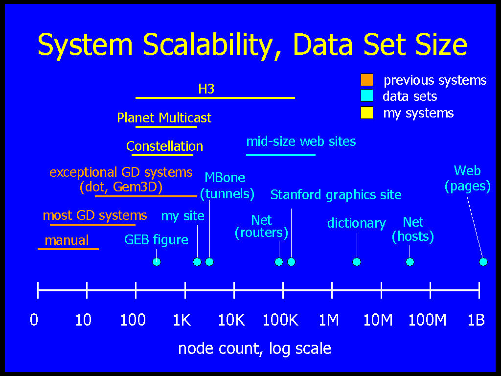
Figure 1.2: System scalability and dataset size. Previous graph drawing systems, shown in blue, fall far short of many large real-world datasets, shown in green. The three systems in this thesis, shown in red, start to close this gap by aiming at datasets ranging from thousands to over one hundred thousand nodes.
Very small graphs can be laid out and drawn by hand, but automatic layout and drawing by a computer program can scale to much larger graphs, and provides the possibility of fluid interaction with resulting drawings. The goal of these automatic graph layout systems is to help humans understand the graph structure, as opposed to some other context such as VLSI layout. Researchers have begun to codify aesthetic criteria of helpful drawings, such as minimizing edge crossings and emphasizing symmetry [BMK95,BT98,DC98,PCJ95,Pur97].
However, almost all previous automatic graph drawing systems have been limited to small datasets. The scalability discrepancy between systems for nonvisual graph manipulation and those designed to create visual representations of them is attributable to the difficulty of general graph layout. Most useful operations for drawing general graphs have been proved to be NP-complete [Bra88]. Most previous systems are designed to create highly aesthetic layouts of general graphs. A paper in 1994 declared graphs of more than 128 nodes to be ``huge'' [FLM94]. More than one-half of the existing graph drawing systems handle only very small input graphs of less than one hundred nodes [Döm94,FW94,Rei94,GT96]. A few exceptional systems such as Gem3D [BF95] and dot [GKNV93] can handle hundreds or even a few thousand nodes.
Although a few thousand or even a few hundred nodes is more than one would want to lay out by hand, Figure 1.2 shows that many real-world datasets are far larger. Backbone Internet routers have over 70,000 other hosts in their routing tables, and the number of hosts on the entire Internet is over 70 million and growing. Dictionaries contain millions of words defined in terms of each other. The Web consists of over a billion hyperlinked documents, and even moderately-sized single Web sites such as the Stanford graphics group site have over 100,000 documents.
The contributions of this thesis fall into two areas: analysis and algorithms.
Our analytical contribution is a detailed analysis of three specialized systems for the interactive exploration of large graphs, relating the intended tasks to the spatial layout and visual encoding choices. Each of these three systems provides a completely different view of the graph structure, and we evaluate their efficacy for the intended task. We generalize these findings in our analysis of the importance of interactivity and specialization for graph visualization systems that are effective and scalable.
Our algorithmic contribution is two novel algorithms for specialized layout and drawing. The H3 algorithm trades off generality for scalability, whereas the Constellation algorithm trades off generality for effectiveness. The H3 system for visualizing quasi-hierarchical graphs has the following advantages over previous work:
The Constellation system for visualizing paths through semantic networks has the following features:
The H3 project was a solo undertaking. The Planet Multicast project was joint work with Eric Hoffman, K. Claffy, and Bill Fenner. The Constellation project was joint work with François Guimbretière.
This thesis begins with motivation for the interactive visualization of graphs and background material on information visualization, followed by a summary of our original research contributions. We discuss related work in Chapter 2.
The next three chapters discuss the software systems at the core of this thesis. Each chapter begins with a task analysis, then covers spatial layout and visual encoding choices, and concludes with a discussion of the results.
The H3 system for visualizing large quasi-hierarchical graphs in 3D hyperbolic space is covered in Chapter 3. Parts of this chapter were described in series of publications. We have published the H3 layout algorithm [Mun97] and the H3Viewer guaranteed frame rate drawing algorithm [Mun98a]. We have also presented a brief overview of both the layout and drawing algorithms, augmented with a discussion of possible tasks that could benefit from a graph drawing system [Mun98b]. A paper that is in press describes the the user study that demonstrated statistically significant benefits of a browsing system incorporating the H3Viewer [RCMC00].
Chapter 4 describes Planet Multicast, a 3D geographic system that displays the tunnel topology of the Internet's multicast backbone as arcs on a globe to help MBone maintainers find potentially misconfigured long-distance tunnels. We have presented this system as a case study [MHCF96].
Chapter 5 is about the Constellation system for visualizing semantic networks using a custom 2D spatial layout. A brief paper described the key aspects of this visualization system [MGR99].
We finish with discussion, future work, and conclusions in chapter 6.