Progressive Multiples for Communication-Minded Visualization
Stanford University
Graphics Interface 2007
This paper describes a communication-minded visualization called progressive multiples that supports both the forensic analysis and presentation of multidimensional event data. We combine ideas from progressive disclosure, which reveals data to the user on demand, and small multiples, which allows users to compare many images at once. Sets of events are visualized as timelines. Events are placed in temporal order on the x-axis, and a scalar dimension of the data is mapped to the y-axis. To support forensic analysis, users can pivot from an event in an existing timeline to create a new timeline of related events. The timelines serve as an exploration history, which has two benefits. First, this exploration history allows users to backtrack and explore multiple paths. Second, once a user has concluded an analysis, these timelines serve as the raw visual material for composing a story about the analysis. A narrative that conveys the analytical result can be created for a third party by copying and reordering timelines from the history. Our work is motivated by working with network security administrators and researchers in political communication. We describe a prototype that we are deploying with administrators and the results of a user study where we applied our technique to the visualization of a simulated epidemic.
Paper
Adobe Acrobat PDF (3 MB) and see the related papers at: hci.stanford.edu/research/isis

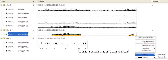
Figure 1. Exploring event data using progressive multiples allows users to interact with a timeline on one row to produce timelines on new rows. Rows are added to the display in sequence and serve as a history of a user’s exploration. Since the timelines are aligned, users can create a different row for each filter and juxtapose the rows to compare the filters. Users can place timelines in folders to group related data. Relationships are defined among events in the time-series with similar metadata. Pivoting on an event creates a new timeline containing the related events. Users can create a visual narrative that illustrates a sequence of interesting events by hiding rows and reordering other rows. In this example we show an exploration of time-series network data where the user has filtered the 171.64 address by port 445, 80, and 22, and then pivoted to the 63.82 address. For privacy purposes, the IP addresses have been anonymized.