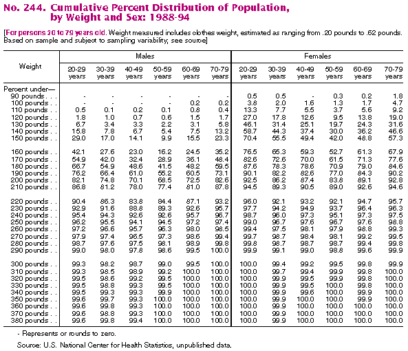
Prelude - Choosing a Topic:I initially considered examining unusual statistics for sporting events. For example, I would have liked to study "the efficacy of prayer on influencing the outcomes of high school football games in southern states." Alas, anecdotal evidence abounded but reputable sources of numerical data were scarce. Thus defeated, I decided to surf the web and read some CNN.
Crisis in America! (Thanks, CNN)CNN's health section featured multiple articles addressing epidemic obesity in the United States. This seemed a viable subject for analysis given that lots of data should be available. Further industrious, disciplined web surfing revealed some acrimonious political argument on the message boards of a fitness site, which led me to wish to correlate obesity with socioeconomic factors, and political affiliation if at all possible.Of the many links to online databases provided with the assignment, LexisNexis seemed like a reasonable source. Indeed, it aggregated data on the societal trend towards corpulence from multiple sources, including the Centers for Disease Control and the National Center for Health Statistics. I will use the data sets obtained by searching the LexisNexis statistical tables with the keyword "obesity", restricting results to those with Excel spreadsheets.
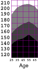
Inspecting the data:The fundamental question I pose is, "Just how fat are we?"Several of the data sets provide information about the means for various populations. However, we might hope to gain particular insight by looking at the overall distribution of bodyweights rather than just the averages. The following table fits the bill nicely:
The Excel spreadsheet for this table includes a set of measurements from the years 1976-1980 as well as the above data from 1988-1994.
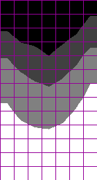
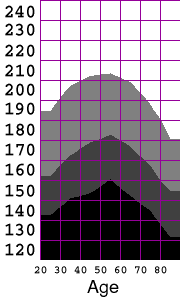
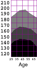
Making a Contour PlotUpon seeing this table, I decided that I would like to visualize the distribution as a contour plot. For example, I would like to be able to extract the contour line representing the weight of the 25th percentile of the population as a function of age. I explored the chart options within Excel, but fail to find an option for generating a contour plot from an array of data. It would be straightforward to find the isocurves in the distribution by writing a marching-square algorithm, but since this assignment is to make use of existing tools, I will use the software I have available. By storing the grid of data as a grayscale image, I can load it into a paint program, resample it at higher resolution, and then quantize the intensities to yield gray bands whose boundaries are the interpolated iso-contours. It is trivial to encode the Excel data in an image file; I just open a text editor and type in the headers for an ASCII-formatted, 7x13, grayscale ppm with pixel values in the range 0..100. I then cut and paste the corresponding rectangle of data directly from the Excel spreadsheet.
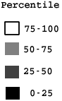
The resulting file is a PPM that can be loaded into the Gimp for processing. As proposed above, I upsample the data (superimposing a grid for easier comparison to the original), and then quantize the intensities into quartiles.P2 7 13 100 # Cumulative percent dist of male population by age and weight # Columns are age ranges: 20-29, 30-39, ..., 70-79, 80+ # rows are weight in lbs: 120, 130, ..., 240 1.8 1.0 0.7 0.6 1.5 1.7 7.7 6.7 3.4 3.3 2.2 3.1 5.8 16.1 . . .
Bodyweights of U.S. Males, by Age:
In RetrospectWell, The Gimp is an unlikely application for conducting exploratory InfoVis. However, since I didn't have contour plotting options readily available in Excel, it ended up being a fairly simple and effective tool for generating the visualization that I wanted from the raw cumulative distribution data.There is a legitimate objection that ANY interpolation of the data may introduce spurious features. I would certainly prefer to have had a denser initial sampling to work with, so that the need for interpolation could have been reduced. In the end, the interpolation was essential in allowing a comparison of the two studies in spite of the different age ranges used. I believe the visualization process I've applied here has preserved the structure of the underlying distribution fairly faithfully.
-Mike Cammarano |