Autocartography
Project proposal for Mike Cammarano
|
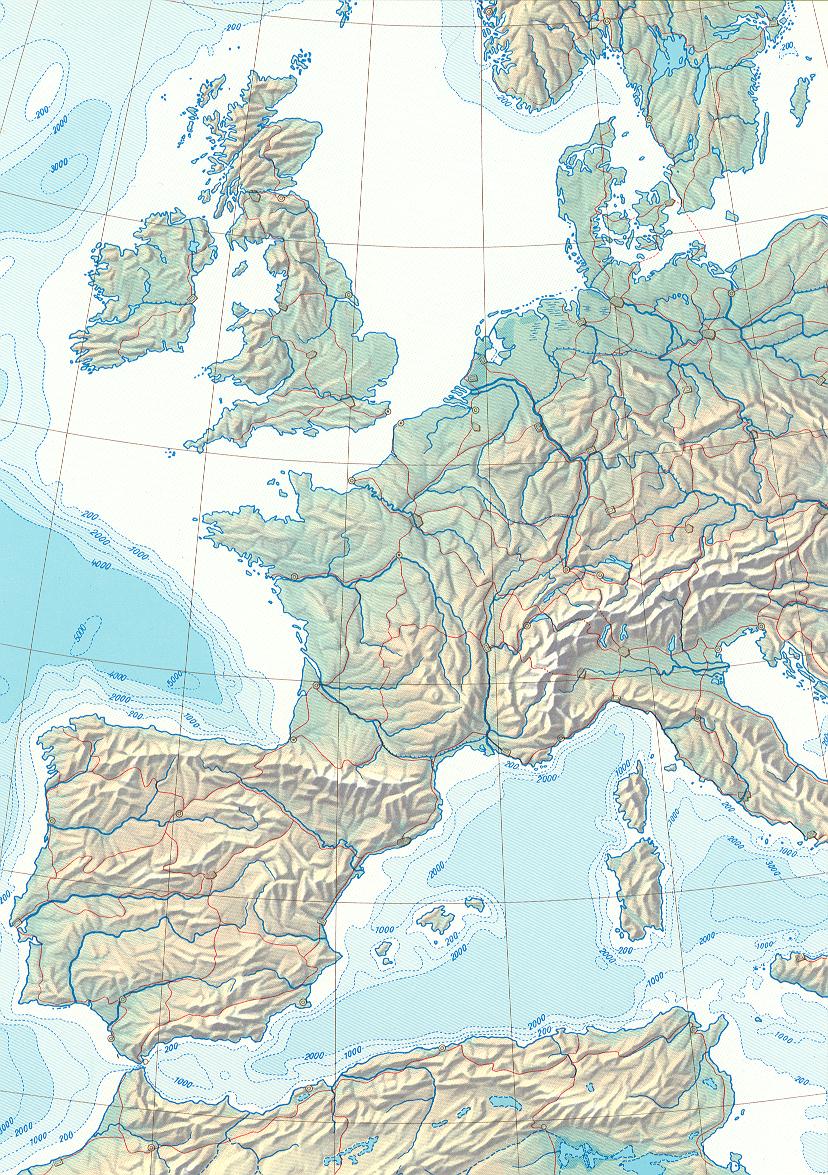
In Cartographic Relief Presentation, Imhof describes many techniques developed in the Swiss map making tradition, and illustrates how these principles can be applied to create aesthetically pleasing maps. Many contemporary applications involve generating maps on demand in response to requests for directions or other GIS data. Temporal and economic constraints clearly preclude the introduction of a skilled human cartographer into the interactive map-making pipeline. However, current systems for automatically generating maps by computer generally produce quite ugly results compared to the subtle shading and intricate linework of handcrafted maps. I propose to incorporate some of Imhof's principles in an automated mapping system. There are a number of subtopics that this could involve; I will list several that I find interesting, roughly ordered by how significantly I feel they contribute to the aesthetic appeal of the maps:
At a minimum, I would like to produce a system that can take raw elevation data and produce an appealing shaded relief illustration. A reasonable extension would be to address road map and route planning depictions. The MapBlast example shown here could benefit from more careful compositing of the text layer above the roads, for example. I believe that improved line-drawing and compositing techniques would significantly clean up ugly artifacts and poor text legibility of the road maps. Furthermore, introducing subtle background texture and shading in the style of the Swiss relief maps could begin to make these road maps more pleasing to the eye.
|
|
