|
Abstract
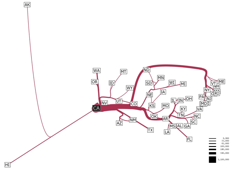
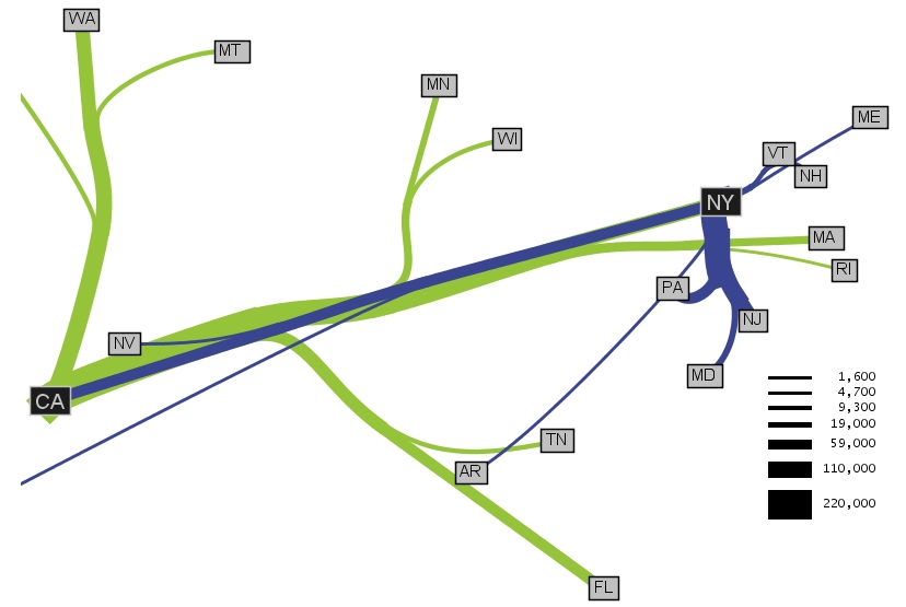
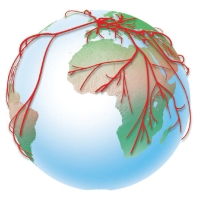
Cartographers have long used flow maps to show the movement of objects from one location to another, such as the number of people in a migration, the amount of goods being traded, or the number of packets in a network. The advantage of flow maps is that they reduce visual clutter by merging edges. Most flow maps are drawn by hand and there are few computer algorithms available. We present a method for generating flow maps using hierarchical clustering given a set of nodes, positions, and flow data between the nodes. Our techniques are inspired by graph layout algorithms that minimize edge crossings and distort node positions while maintaining their relative position to one another. We demonstrate our technique by producing flow maps for network traffic, census data, and trade data.
|
|
Paper
Adobe Acrobat PDF (2 MB)
Jan 7, 2012. Please note, there is a typo in the paper:
In the Rooted Clustering section (on the right side of page 3), the section says: "Suppose the algorithm wants to merge clusters C1 and C2 because they are the closest in the system. Before it does so, it checks to see if C1 or C2 contains the root node r. Suppose C1 contains r. C2 is marked for attempting to merge with the root. The algorithm looks for another cluster C3 to merge with C2. C3 must be unmarked and distance(C2,C3) <= distance(C2,
root)"
However, this last sentence "distance (C2, C3) <= distance (C2, root)" should read "distance (C2, C3) <= distance (C3, root)"
Slides (pdf)
|