Assignment 4: Architecture and InteriorsJon Spivack | ||
|
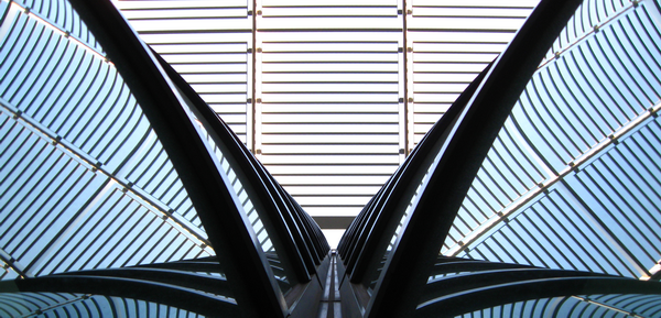
This is actually a photo of the same buildings as the last one, but from a much cooler perspective. It is meant to fit requirement 1 (vertical vanishing point), as the vertical lines at the center of the bottom of the picture meet at that triangular opening about a quarter of the way up. I used f/2.6 and 1/80 of a second, allowing for medium exposure that made the sky directly white but blue in the reflections on the building. I didn't zoom at all, and left focus on auto. Afterward I cropped and rotated 180 degrees in Photoshop. | ||
| << Previous | Back to All Photos | Next >> |
